Proteus
was achieved in 4 Months, from Jan. to Apr. 2021
using Adobe Ae, Adobe Ai, Adobe Me and Trello
Overview
Proteus was a main menu concept for a fictional narrative-driven sci-fi-inspired console game.
With the intent of learning Adobe After Effects to a qualified degree — without any prior knowledge — Proteus drew on established UX/UI intuition and narrative imagination and was created entirely within the software package.
By learning software fundamentals, basic motion graphic techniques, and intermediate-level tools, I am more confident with After Effects and my ability to create motion graphics.
The soundtrack used for this project was Snow by Dutch composer Phlox. One can listen to Snow at soundcloud.com/phlox_music/snow.
This discovery explores the production of Proteus' main menu.
Title Screen
First Variation's Lo-Fi Wireframe
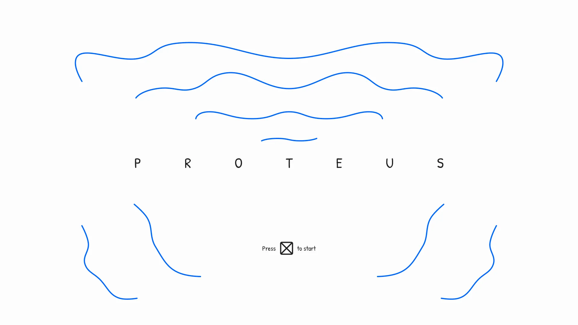
To begin wireframing the menu's UI, I designed its title screen.
For the first variation, the screen's design consisted of minimal elements. A centrally aligned letter-spaced game title featured prominently above a small "Press X to start" CTA.
The "hero" motion (depicted in blue) took inspiration from wave demonstrations. Waves would float around the title and decrease in length the closer they were to it. This idle state would persist for the lifetime of the screen.
Second Variation's Lo-Fi Wireframe
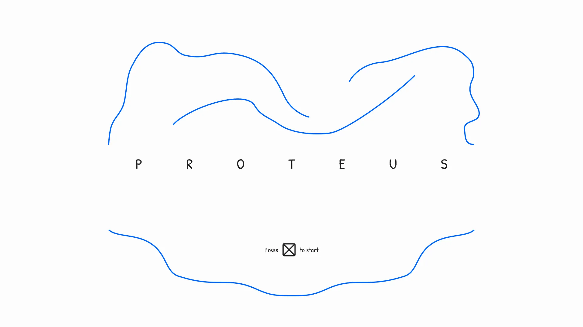
For the second variation, I experimented with the screen's hero motion.
The previous variation's motion was changed, favouring new inspiration from strands of string.
Various abstract strands of motion would overlap each of three splines floating above the title. A more deliberate spline of strands would float underneath the screen's CTA, slightly curling as the strands would flow back and forth for the lifetime of the screen.
Third Variation's Lo-Fi Wireframe
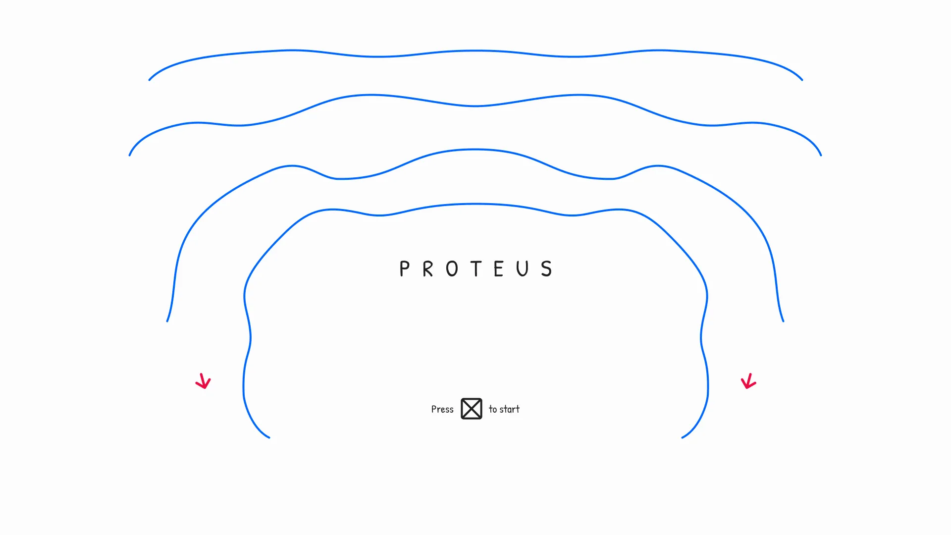
For the third variation, I devised a screen transition (depicted by red arrows) and reverted the hero motion to wave form.
The game's title was condensed to create more space for the hero motion.
Waves would float above the title until the player executed the CTA. Afterwards, the waves would simultaneously seep down the sides of the screen. Finally, the waves would nest at the bottom of the main screen.
Fourth Variation's Lo-Fi Wireframe
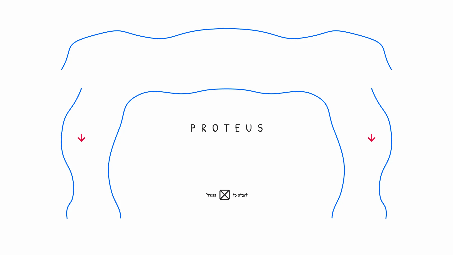
For the fourth variation, I reverted the hero motion to abstract strand form.
The screen's condensed title and CTA persisted, while the premise of the hero's motion transition remained.
Four splines of overlapping strands would float around the top and sides of the title. Upon CTA execution, the strands would seep down the sides of the screen before nesting at the bottom of the main screen.
Fifth Variation's Lo-Fi Wireframe
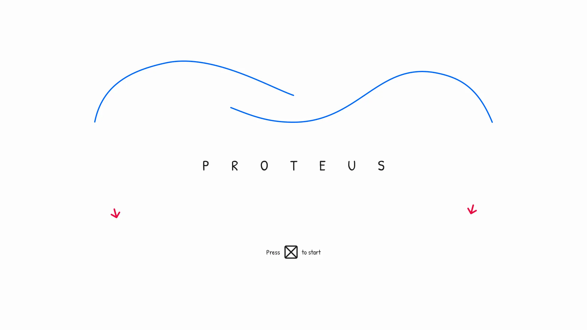
For the fifth variation, I defined previous ideas.
The title's letter spacing was slightly expanded to still allow motion to flow freely.
The hero motion was minimalised to two distinct splines of strands and maintained its transition logic. The decrease in the number of splines would hopefully make for a more impactful screen transition; less is more.
Main Screen
First Variation's Lo-Fi Wireframe
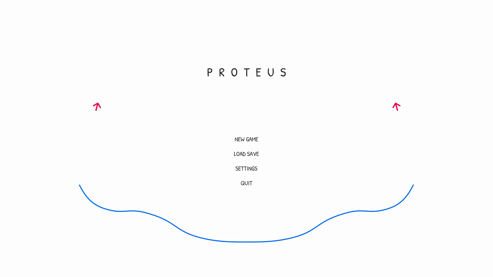
After designing the menu's title screen, I designed its main screen.
The title screen initiated the menu's hero motion. Therefore, each additional screen would need to follow this concept.
So, for the first variation, the title's letter spacing would decrease as the hero motion's strands begin to seep down upon CTA execution. Afterwards, the four main screen buttons would fade in, one below the next. Finally, the strands would nest at the bottom of the screen.
Second Variation's Lo-Fi Wireframe
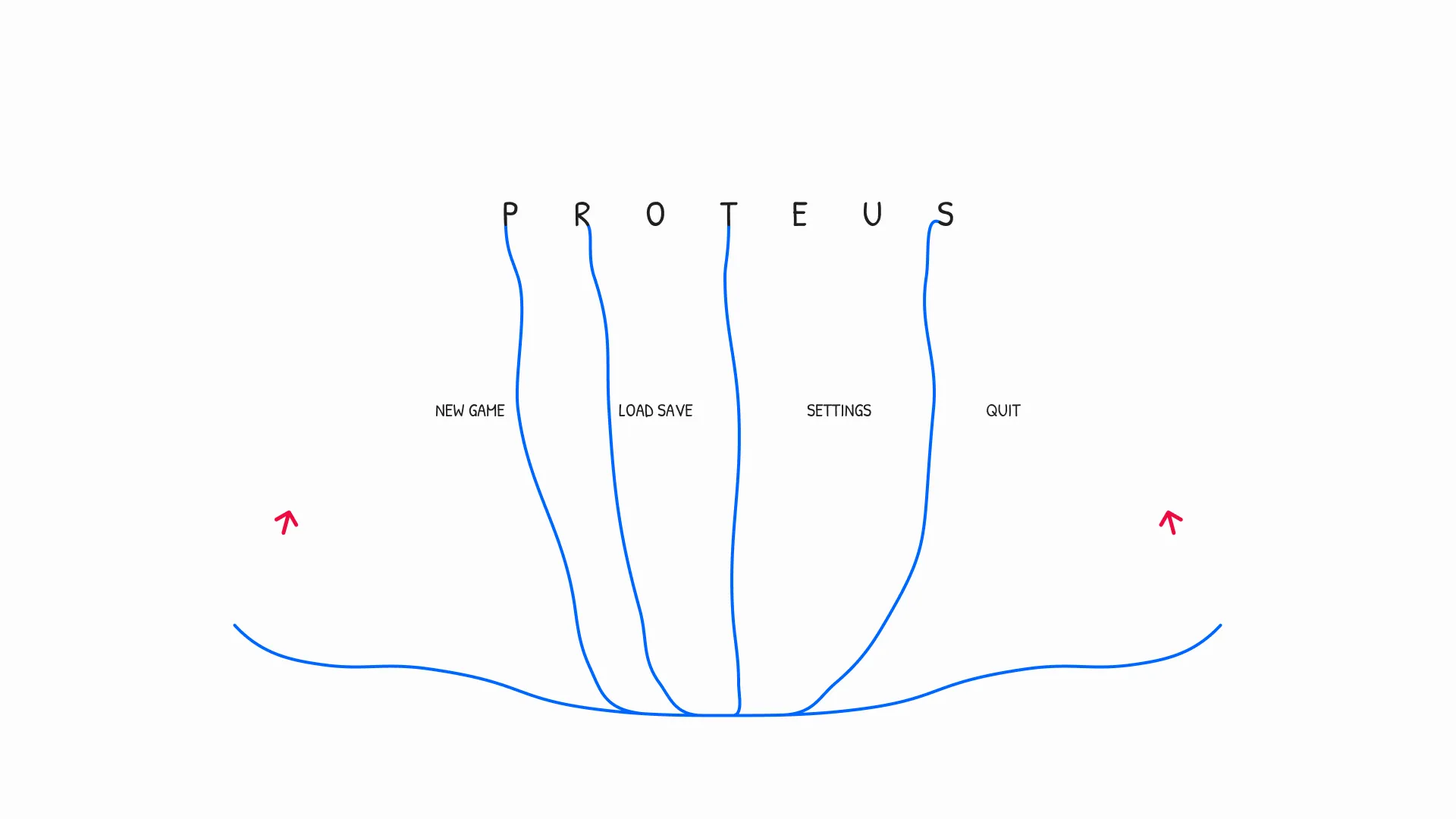
For the second variation, I continued my experiments with the hero motion.
The screen's buttons changed to a horizontal layout inspired by games in the sci-fi genre.
The title would be blended into the hero motion by producing splines of strands from each stem and descender of its letterform. These strands would seep into the nested hero motion below for the lifetime of the screen.
Third Variation's Lo-Fi Wireframe
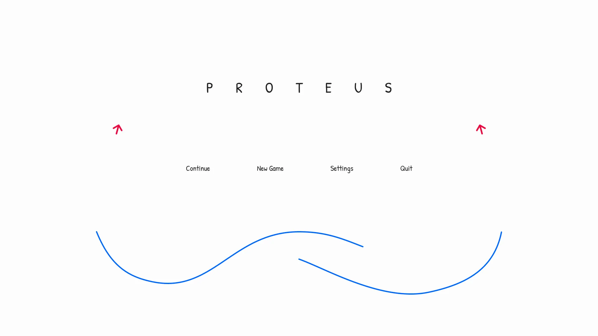
For the third variation, I removed the title strand motion due to illegibility concerns.
The "load save" button was exchanged for a "continue" button to save time for the player loading into the game.
The hero motion's transition would occur as expected. However, its nested state would mimic its title screen idling state as a flipped canvas, keeping the two splines detached.
Fourth Variation's Lo-Fi Wireframe
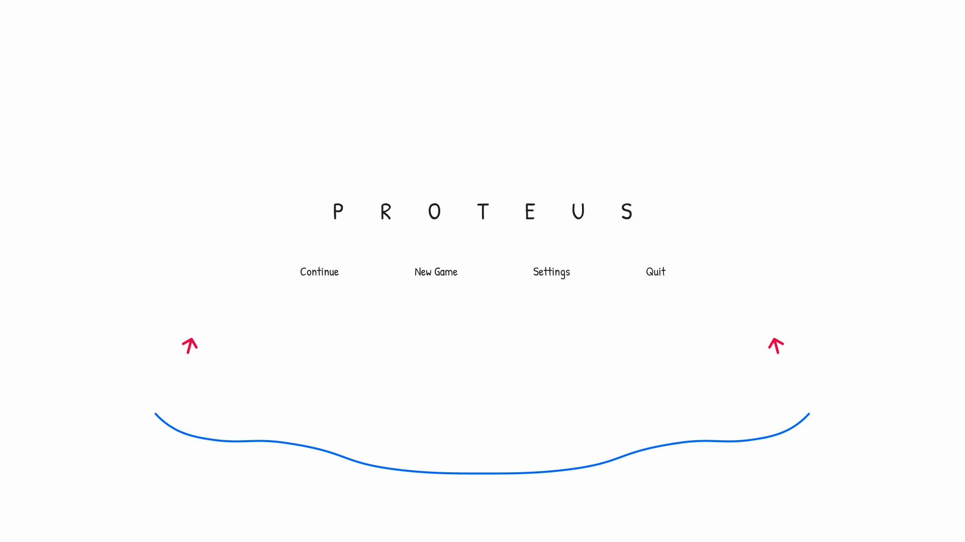
For the fourth variation, I revised the screen's layout.
The layout of the previous variations created three levels of grouped elements. These layouts could evoke feelings of disorder. So, the padding between the title and main buttons was decreased to create unity.
The hero motion's nested state was simplified to a single large spline of strands resulting from overlapping the title screen's dual splines.
Settings Screen
First Variation's Lo-Fi Wireframe
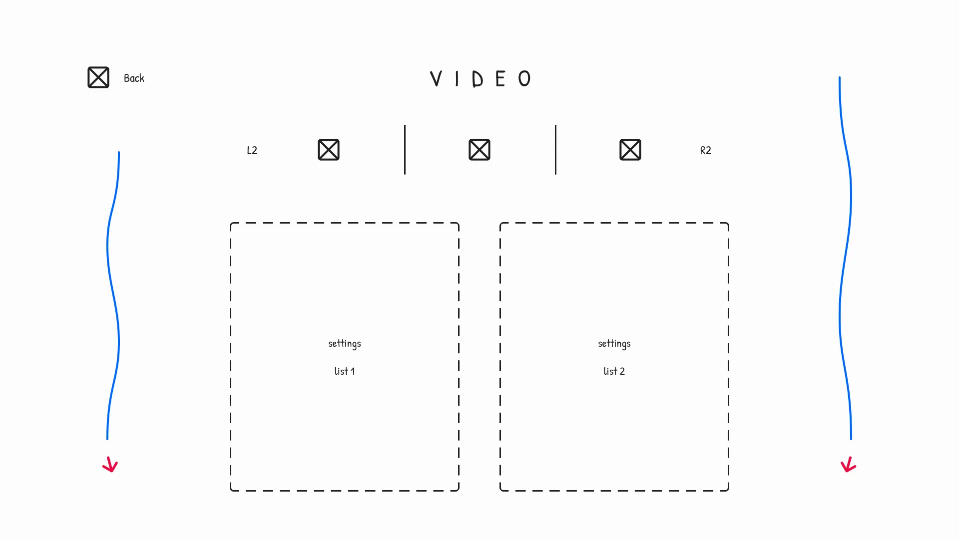
After designing the menu's main screen, I designed its settings screen.
The settings screen would be the busiest in terms of UI elements due to its nature of occupying more information. So, symbolism was used to retain minimalism.
For the first variation, symbols for each setting category would exist in a segmented tab navigation bar. The hero motion's transition would split the splines from their nested idle state on the main screen.
Second Variation's Lo-Fi Wireframe
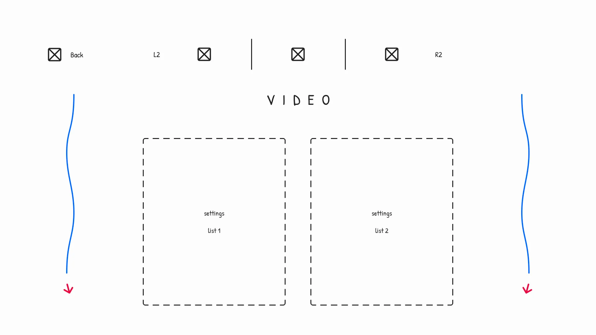
For the second variation, I altered the screen's layout.
The navigation bar and its title element were flipped to suggest the bar was an overarching feature that wouldn't disappear for the lifetime of the screen. The title would show what the selected setting category was.
The hero motion's right-aligned spline was decreased in height to create more symmetry.
Third Variation's Lo-Fi Wireframe
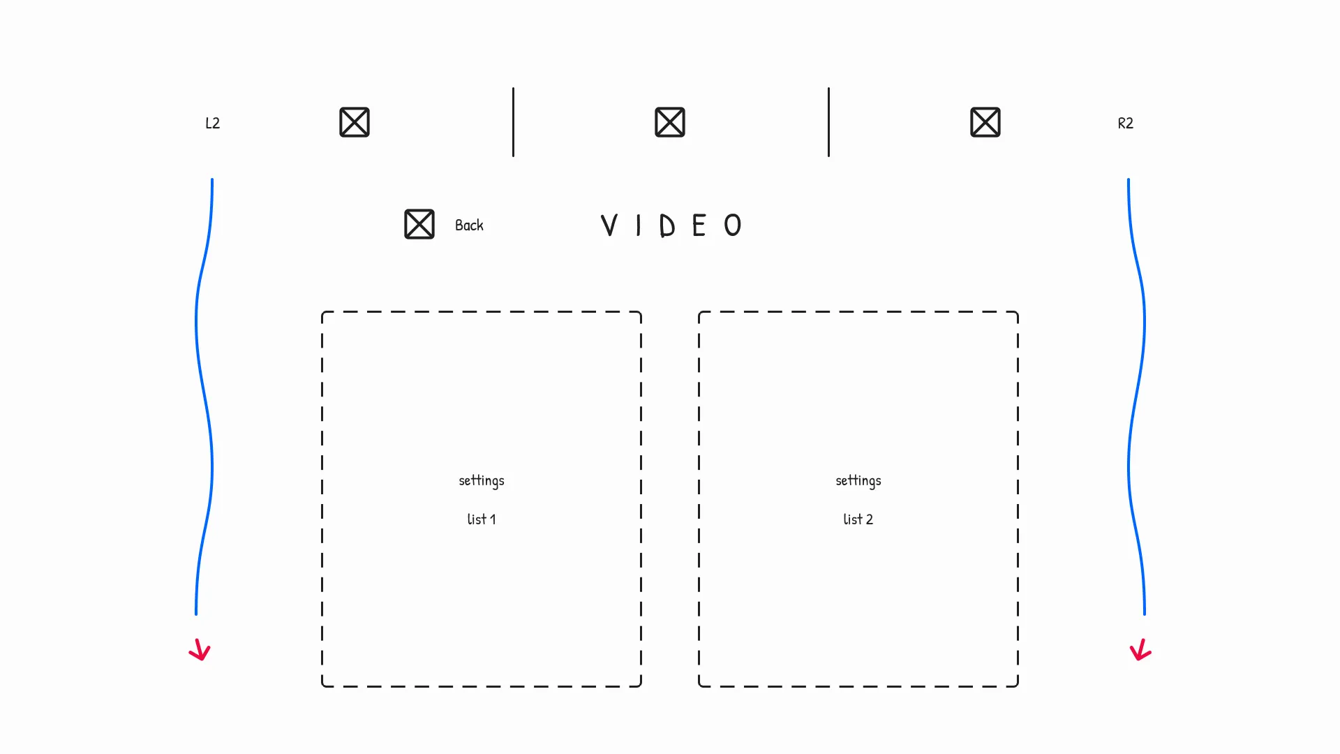
For the third variation, I continued to alter the screen's layout.
A more uniform layout was proposed, where the hero motion encompassed all UI elements.
While the hero motion persisted, the screen's back button was merged with the navigation bar's title. The navigation bar was increased in length to allow its L2 and R2 control elements to match up with the hero motion to further the screen's symmetry.
Fourth Variation's Lo-Fi Wireframe
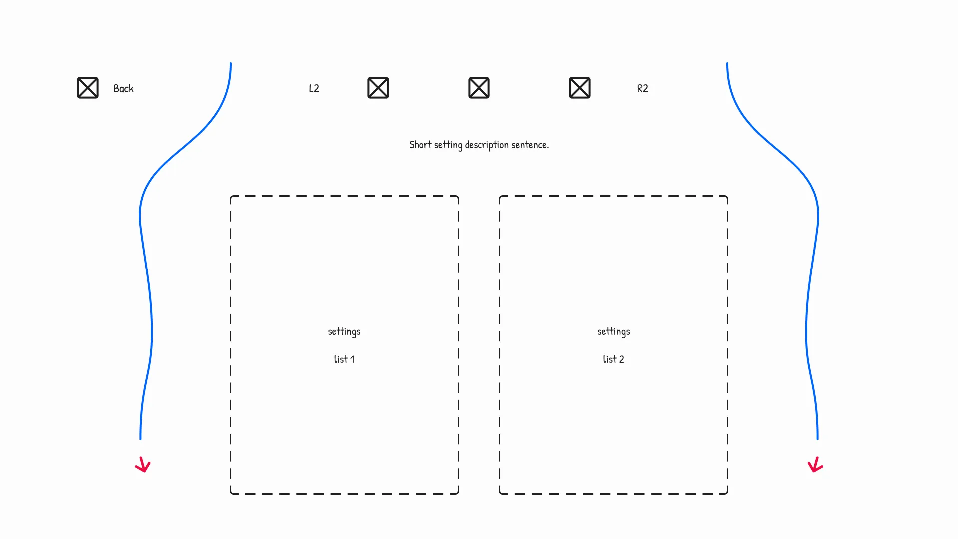
For the fourth variation, I optimised the screen.
The back button's location was reverted, and the tab navigation bar's divider lines and title were removed. A short sentence was introduced that would describe each setting the player was changing, providing a better UX.
The hero motion would extend to the upper limits of the screen and arc to detach the back button and navigation bar.
Fifth Variation's Lo-Fi Wireframe
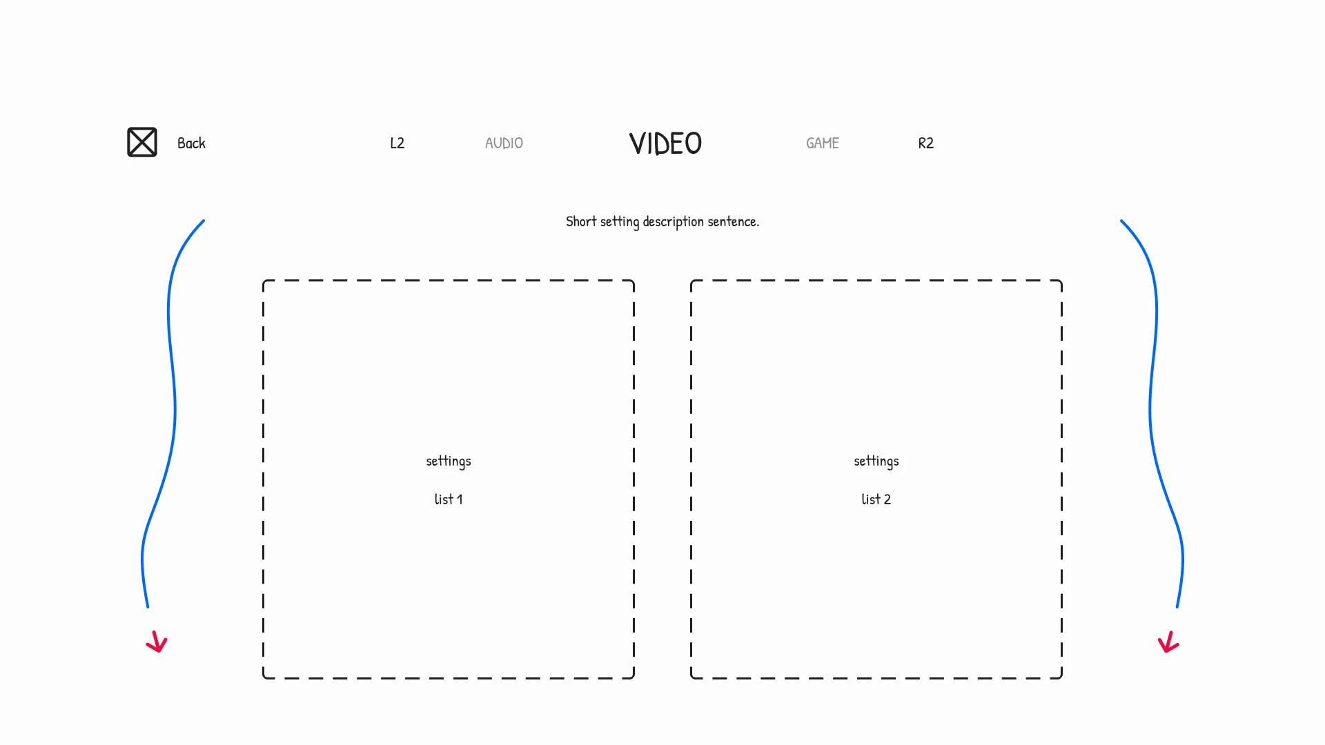
For the fifth variation, I reverted to a text-based layout.
The navigation bar was altered to use text instead of symbols, which combined the bar's prior symbolism and title. The category's text would employ a selection state through sizing and opacity values, enhancing the screen's UX.
The previous variation's back button was deemed too detached. So, the hero motion's expansion was reduced, but the arced shape of its splines remained.
Extras Screen
First Variation's Lo-Fi Wireframe
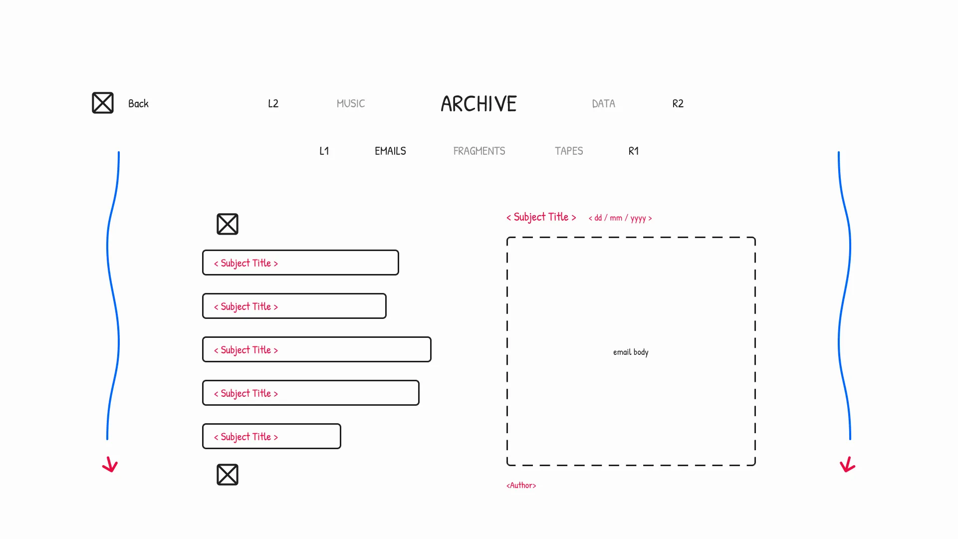
After designing the menu's settings screen, I designed its extras screen as a stretch goal.
The extras screen would hold the collectables the player found in the game's world.
For the first variation, the layout mimicked that of the settings screen to create menu consistency. The tab navigation bar was duplicated to create an additional bar. Each category would contain a scrollable list to navigate and select a collectable, and a pane to view the selection.
Second Variation's Lo-Fi Wireframe
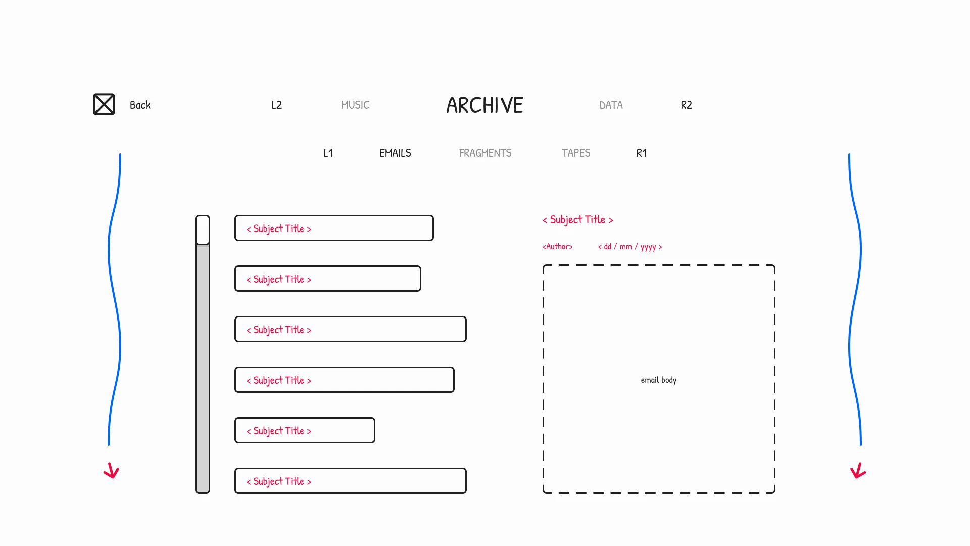
For the second variation, I reorganised the collectable's layout.
The collectable list's arrow indicators were changed, favouring a scrollbar. The scrollbar would make the length of the list more coherent at a glance.
A new layout was formed for the selection pane, where the author's signature would be grouped with the subject's title and date of entry. The hero motion and its logic persisted from the settings screen.
Third Variation's Lo-Fi Wireframe
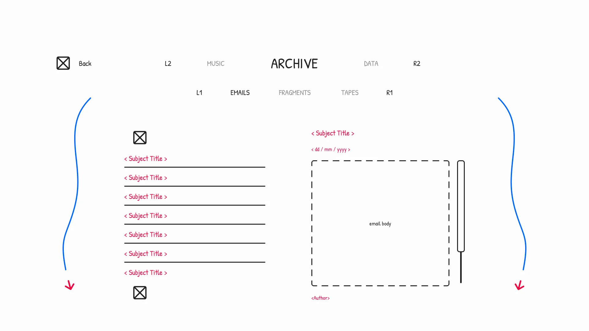
For the third variation, I minimalised the screen's layout.
The collectable list's entries were streamlined using dividers, and its scrollbar was reverted to using arrows. The selection pane's layout was reverted so that its data flow matched real-world dialogue. The pane also introduced a minimal scrollbar to view the length of the collectable at a glance.
The hero motion was changed to fit the latest settings screen variation and top off the screen.
Style Guide
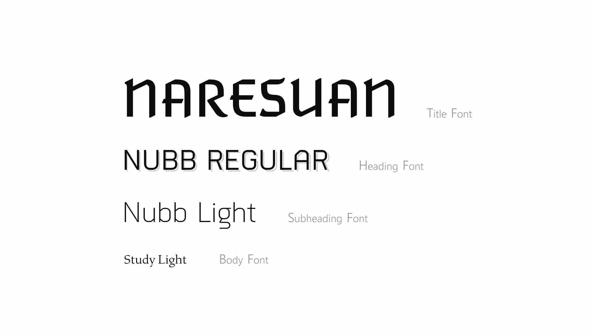
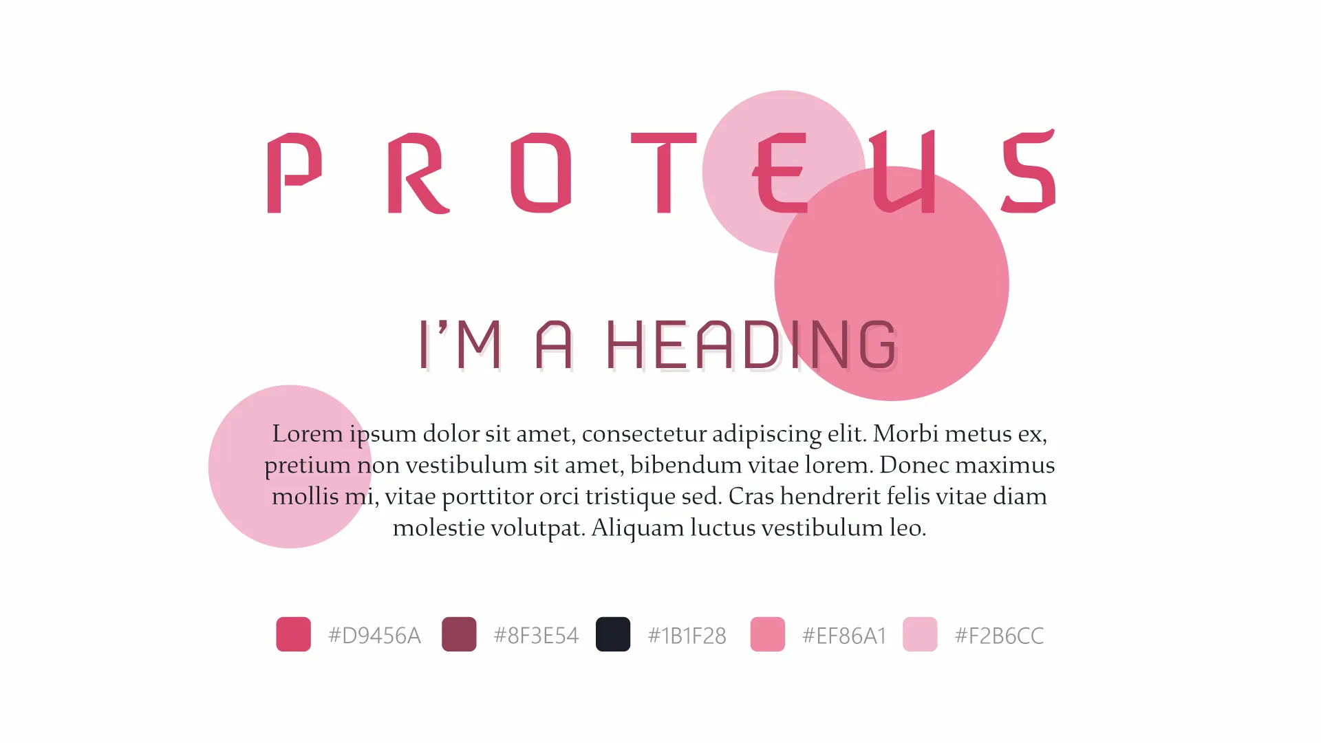
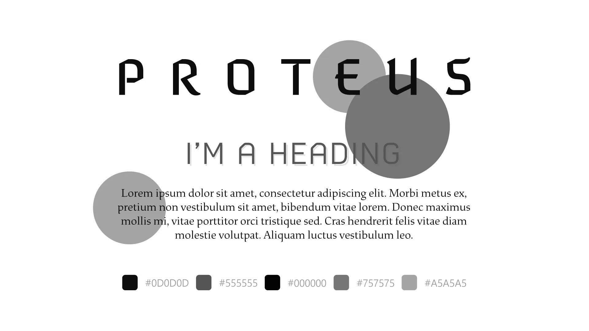
After designing each screen through wireframes, I formed the project's style guide.
I curated a list of fonts that took inspiration from games in the shooter, narrative, and sci-fi genres, where many occupied sharp San-Serif fonts. My chosen fonts were Naresuan, Nubb, and Study.
I avoided clichéd colours of the sci-fi genre to satisfy my target audience. Initially consisting of shades of pink, I revised the project to favour shades of grey due to a wide misconception of the palette's meaning.
Hi-Fi Wireframes
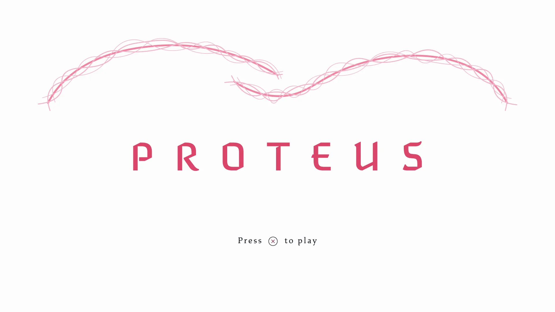
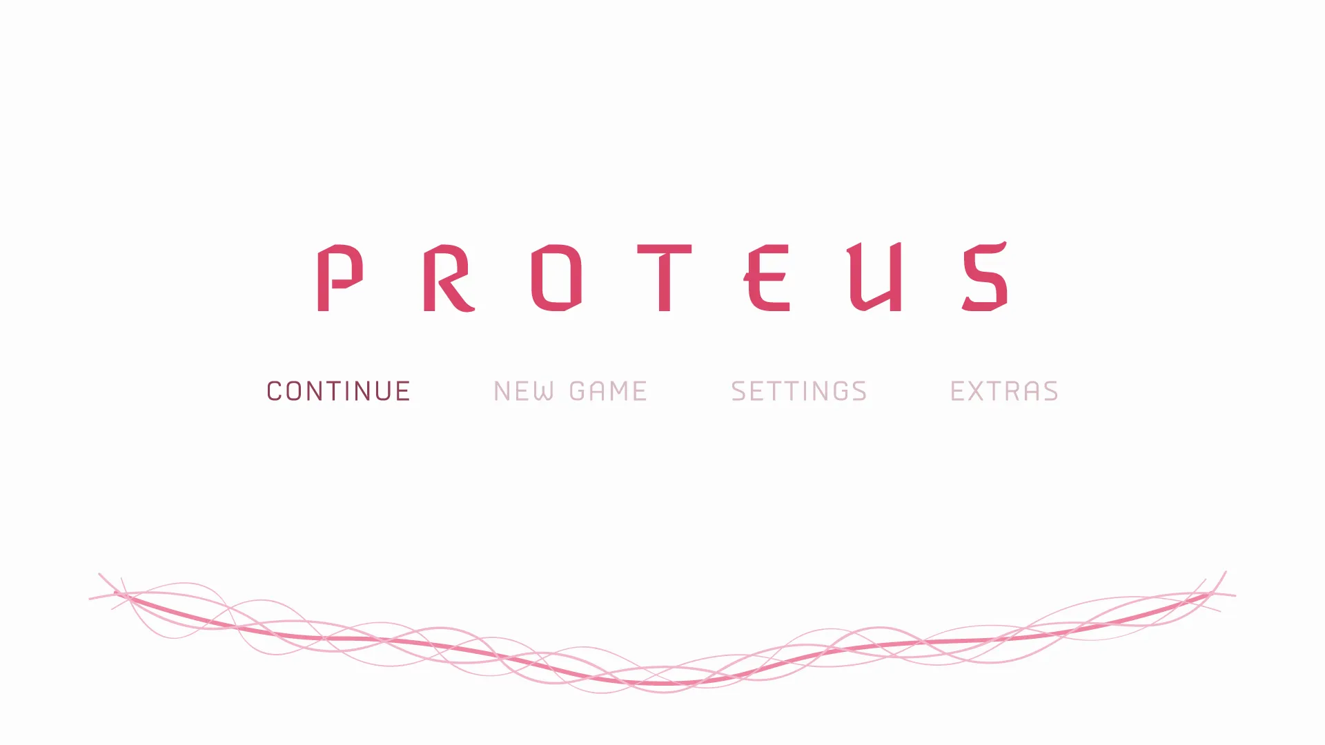
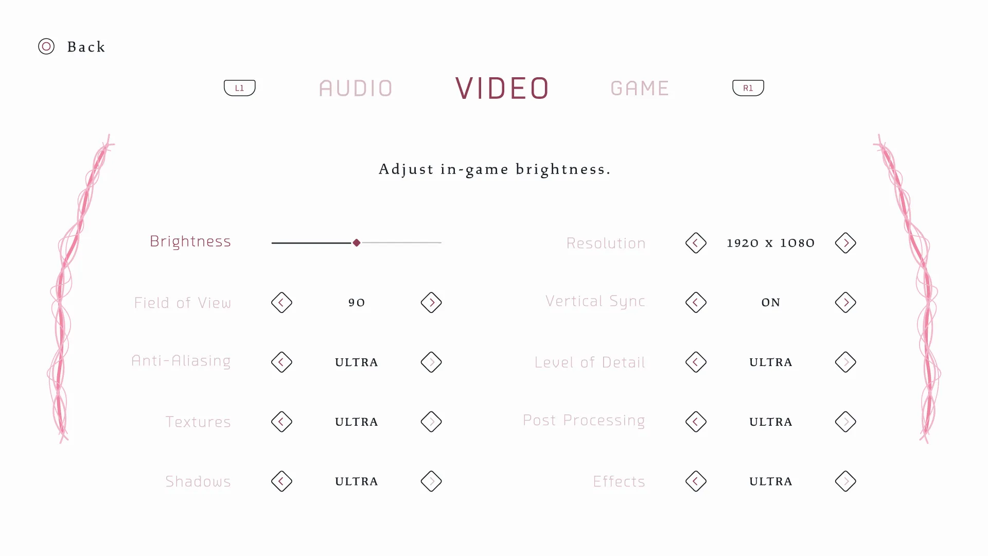
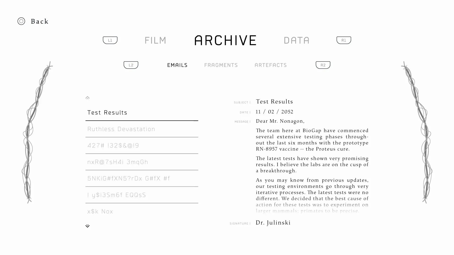
After arranging the project's style guide, I increased the fidelity of each screen's latest wireframe to test the guide's colour and typography choices.
The setting and extra screens were clarified with the inclusion of appropriate content. Changes were made to the positioning of selected elements on each screen.
While still looking mocked up, the menu's hero motion was also more evolved, aiding in the depiction of its flow. The whole menu was beginning to take shape.
Daily UI
Daily UI was a design challenge I undertook in the Summer of 2020 to hone my UX/UI design skills and software knowledge. The challenge helps designers increase their skills in the field by supplying weekday briefs.