Daily UI
was achieved in 4 Months, from Jun. to Sept. 2020
using Adobe Ai, Adobe Ps and Adobe Xd
Overview
Daily UI was a design challenge I undertook in the Summer of 2020 to hone my UX/UI design skills and software knowledge.
The challenge helps designers increase their skills in the field by supplying a miniature brief every weekday for one hundred days. One can read more information about the challenge at www.dailyui.co.
As the days passed, I reached my self-assigned goal, increasing my knowledge of respective tools — notably Adobe Xd — and UX/UI design.
This discovery is dedicated to twenty personally favourite designs from my daily exploration.
Day 007
Settings
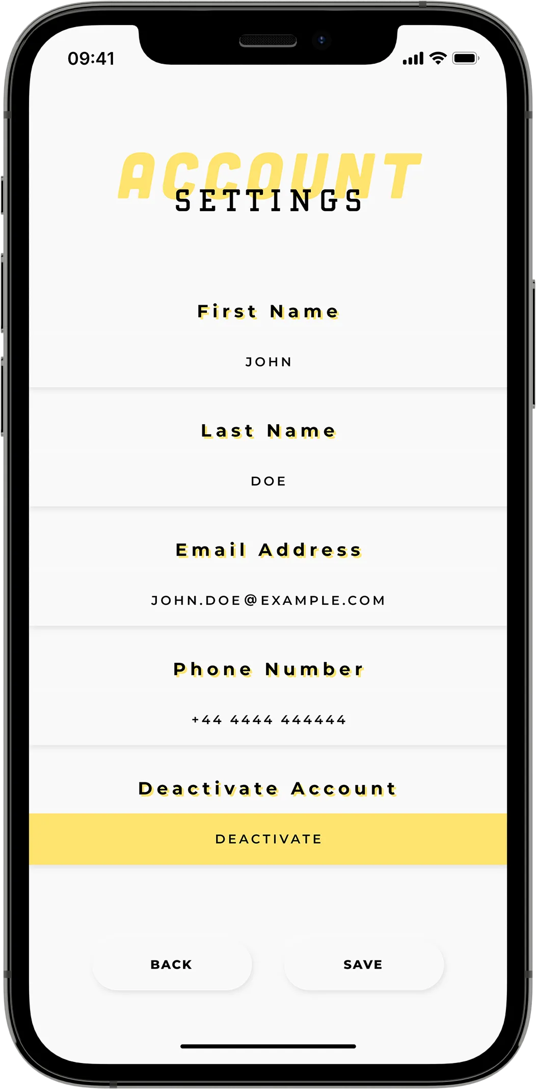
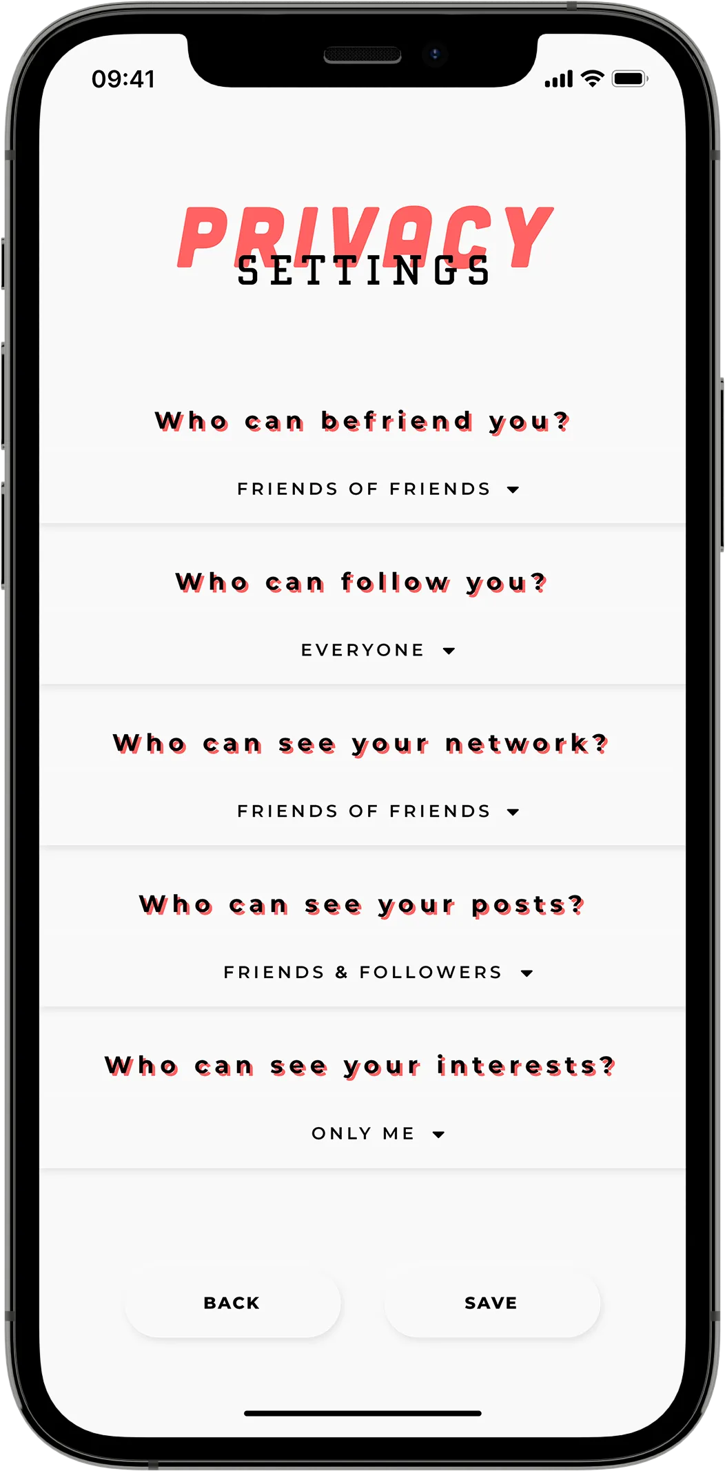
Day seven's brief was to design settings for something, whether for an app's privacy settings or a game's graphic settings.
The idea was to use neumorphism in tandem with a vibrant colour palette to emphasise the interface's typography.
The concern for design was incorporating all the settings I thought necessary in the minimalistic style I desired. However, blending typography with vibrancy has emphasised text elements while maintaining an accessible structure.
Day 009
Music Player
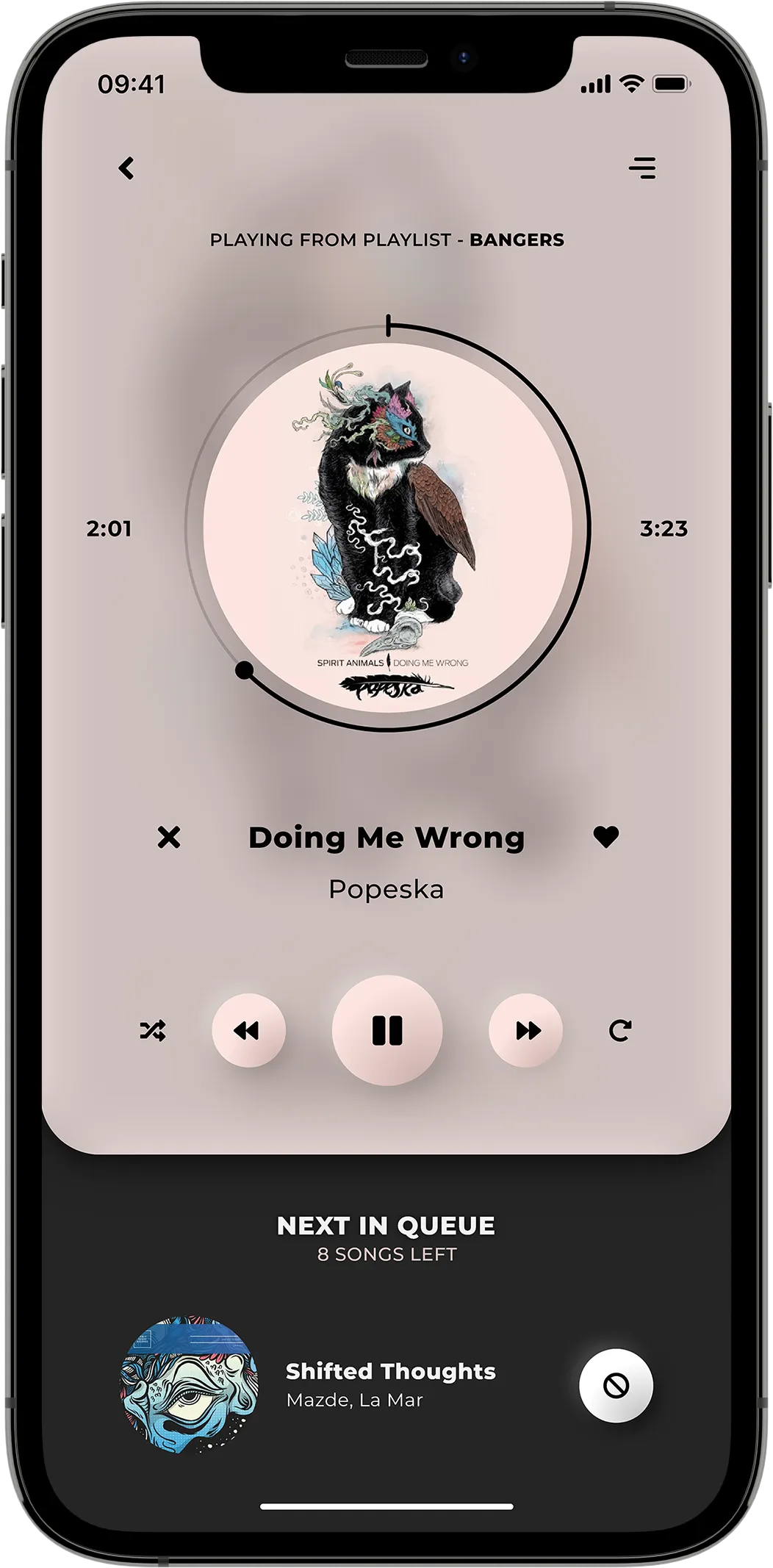
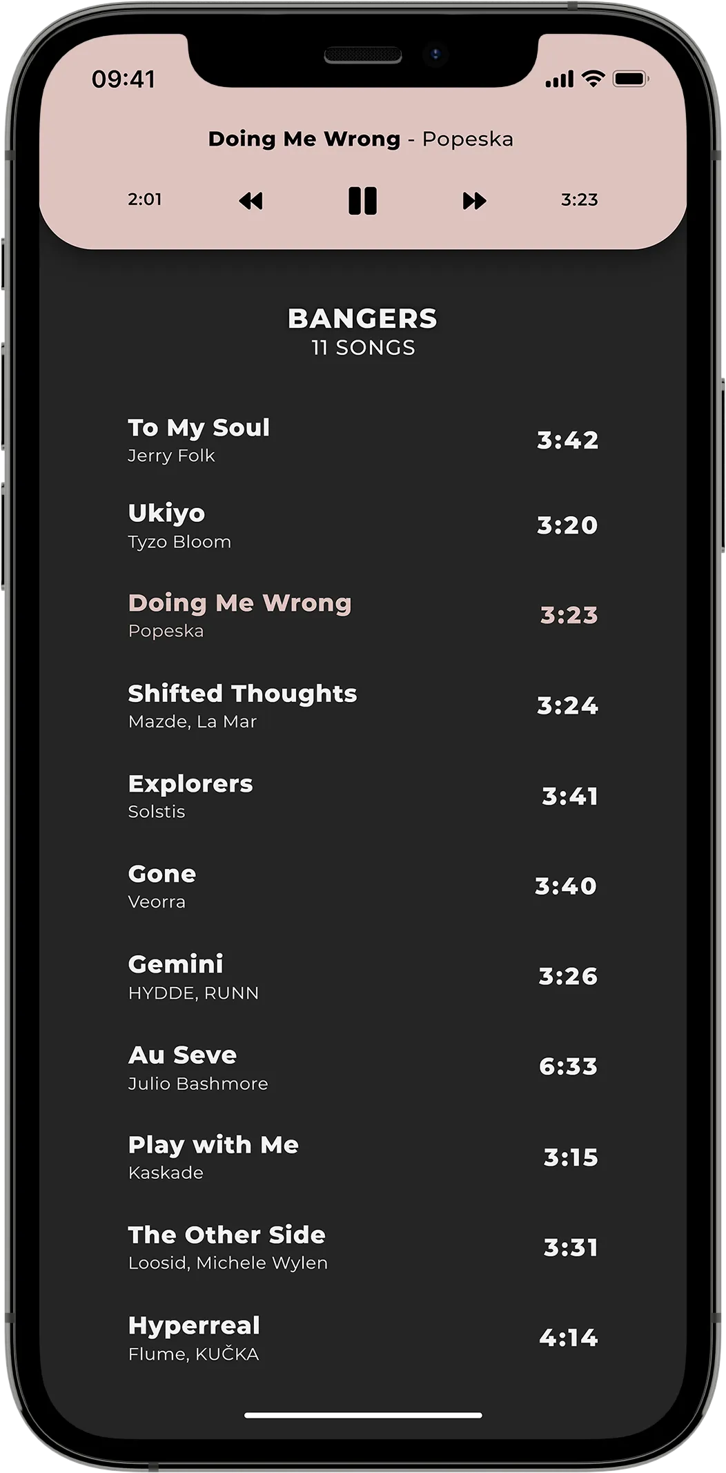
Day nine's brief was to design a music player, considering its controls, placements, album imagery and device type.
The idea was to heavily integrate album imagery into the interface aesthetic, dynamically coordinating a global base colour palette for each album.
The element positioning and dynamic colours provide the album imagery influence while creating an accessible and legible experience. Subtle neumorphism enhances the multimedia elements and provides a contemporary-inspired style finish.
Day 012
eCommerce Shop (Single Item)
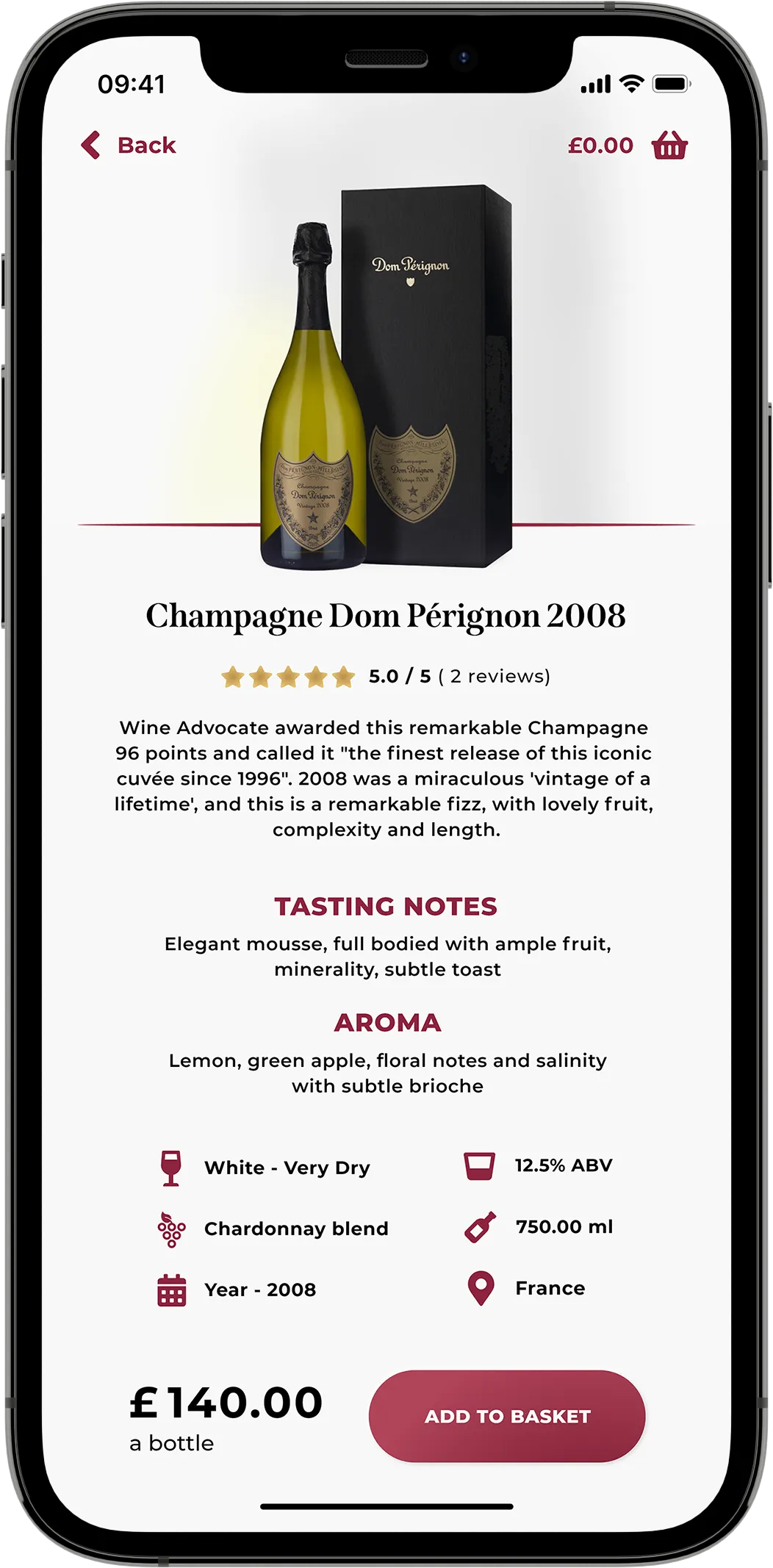
Day twelve's brief was to design an eCommerce shop for a brand, whether for a local business or a large online retailer.
The idea was to design a product screen for a Laithwaite's Wine app, combining symbolism and concise information architecture.
Structuring information with symbolism provides a coherent interface, while the Laithwaite's brand can be felt through magenta accents. Testing suggested that users successfully identified the price, basket, and product name elements.
Day 013
Direct Messaging
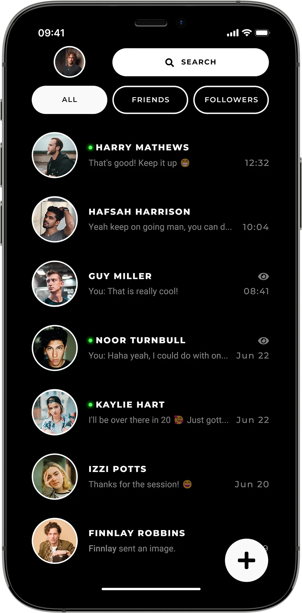
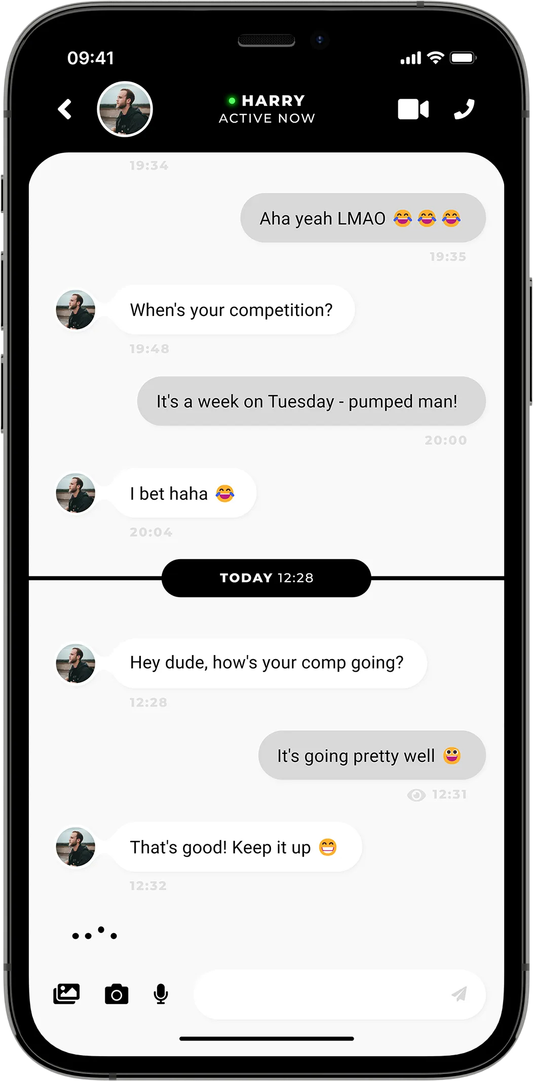
Day thirteen's brief was to design a direct messaging app, profile, or chatbox, considering message context, involved parties, and images.
The idea was to derive context from an earlier brief to design an archery social messaging app, utilising a monotone colour palette.
The design incorporates the earlier brief's style, while the active user glow effect provides an accented boost from the global monotone base colours. Testing suggested that users found the interface to be accessible and usable.
Day 024
Boarding Pass
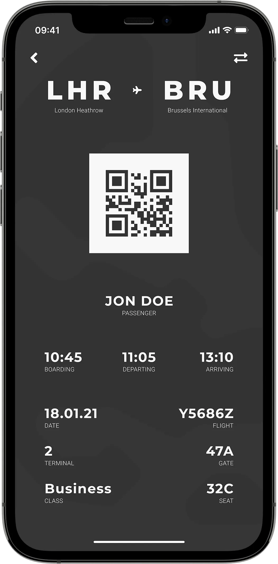
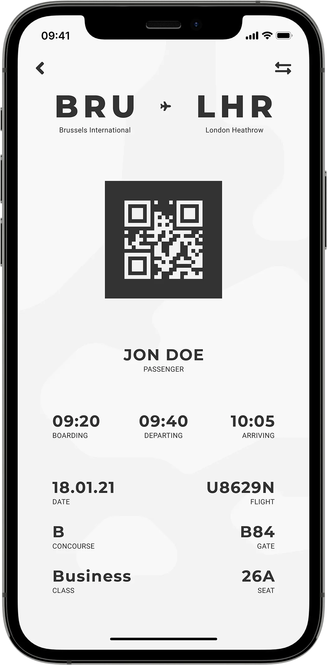
Day twenty-four's brief was to design a boarding pass, considering the place of origin, destination, gates, seats, and airline.
The idea was to emphasise an incorporated QR code within an orderly structured boarding pass screen for an integrated travel app.
The near-centre positioning of the QR code provides the element's significance and allows ample room to present other vital content. The monotone colours offer an accessible experience and unique style.
Day 029
Map
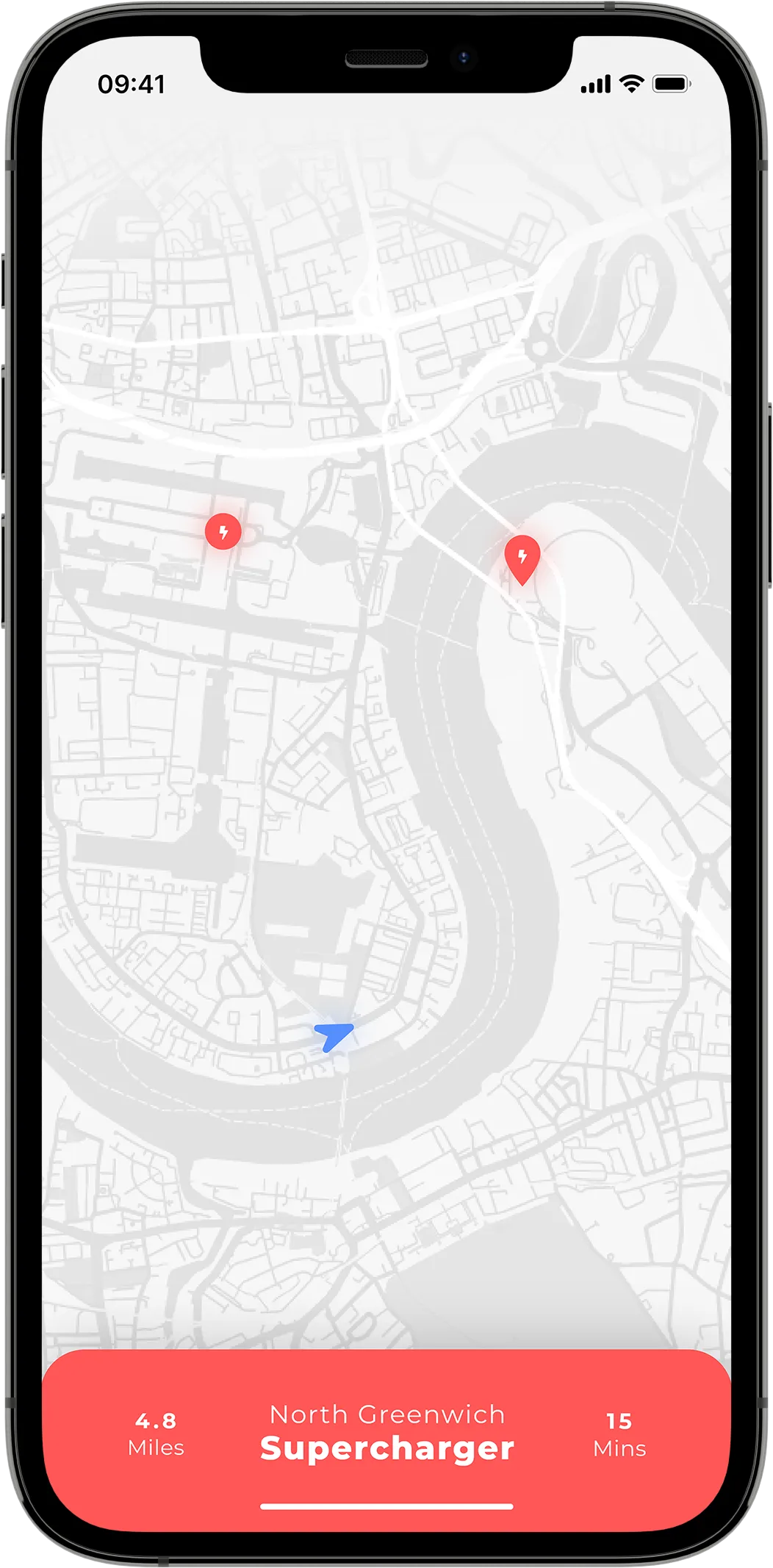
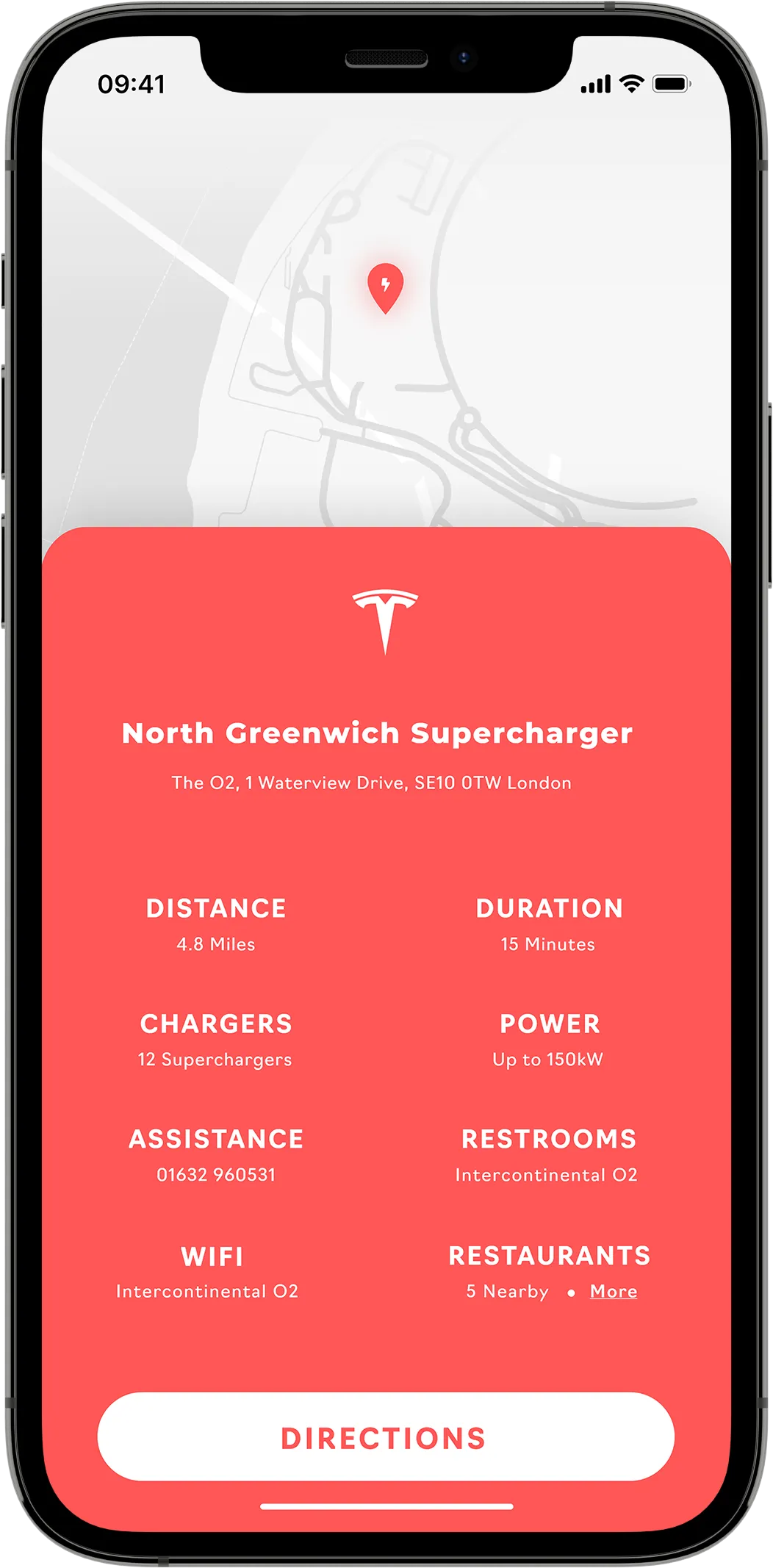
Day twenty-nine's brief was to design a map in any style, depicting any medium, for any intended purpose.
The idea was to design a charging station discovery feature for a Tesla companion app, blending system themes with a brand-coordinated colour palette.
The concern for design was with devising its idea. However, the interface feels tailored and akin to the Tesla brand through its map element serving user system theme preference and red palette balancing contrast.
Day 032
Crowdfunding Campaign
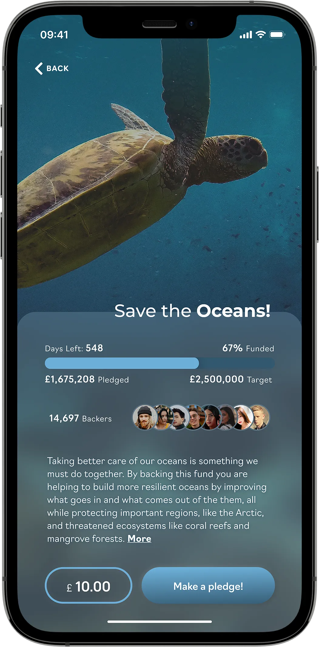
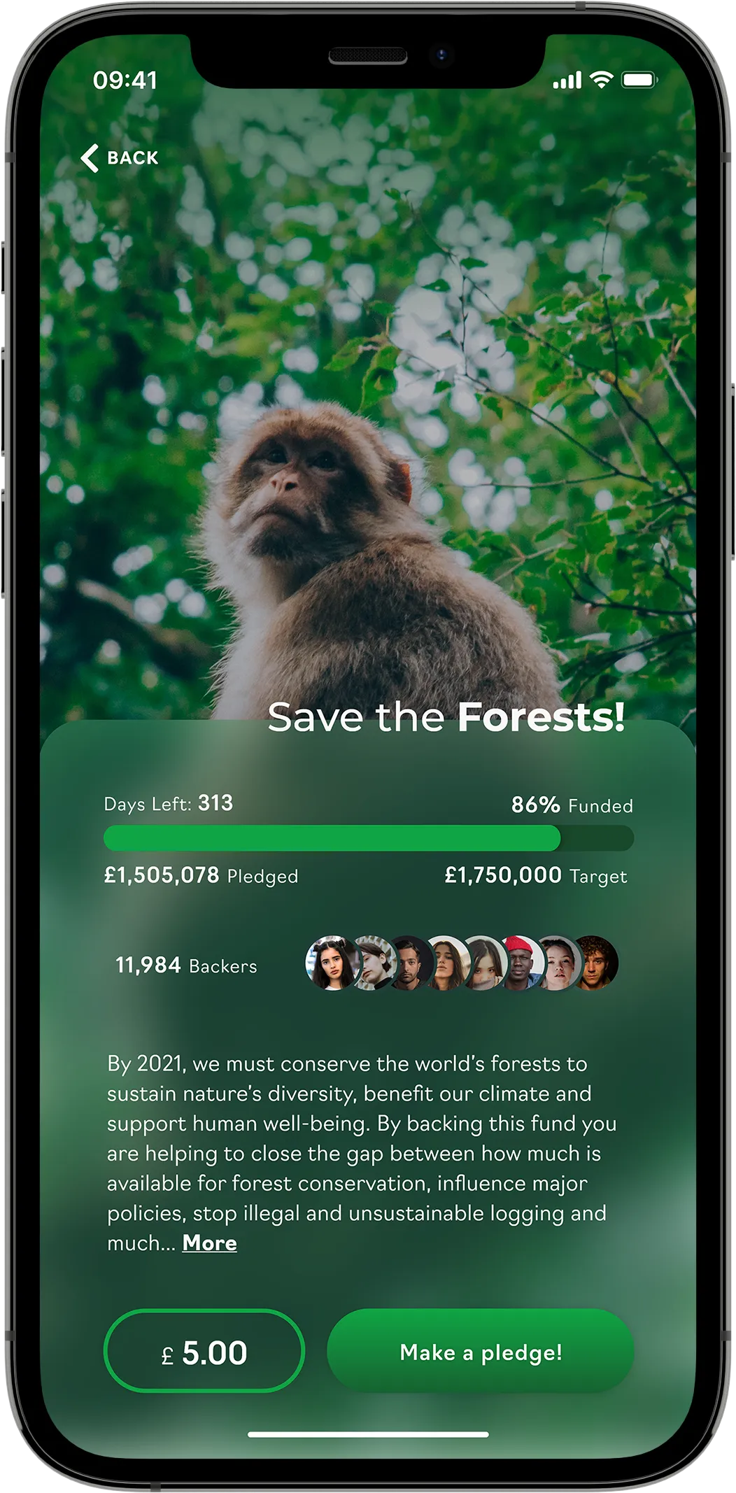
Day thirty-two's brief was to design a crowdfunding campaign, considering the purpose of raising funds via compelling stories.
The idea was to divide imagery and informational content using blur effects to design an international crowdfunding app.
Compelling stories have been devised using rounded backdrop blur effects to divide eye-catching imagery and campaign content. Concurrently, cohesion is created through a dynamic campaign-inspired base colour palette.
Day 035
Blog Post
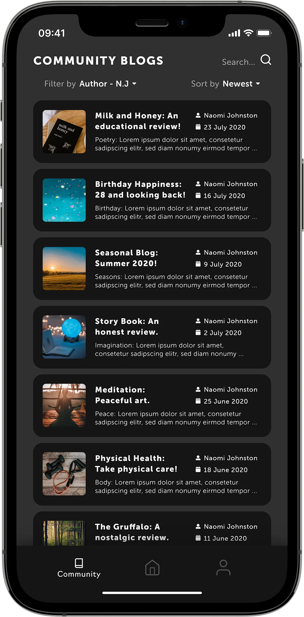
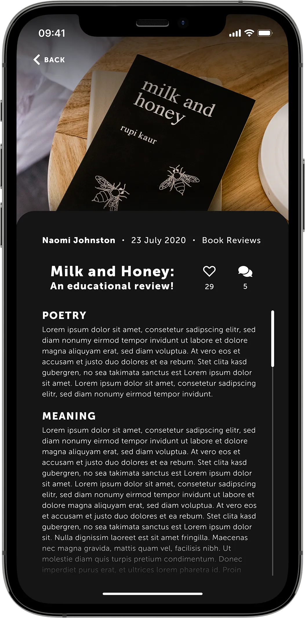
Day thirty-five's brief was to design a blog post, considering its content, author, date, category, and comments.
The idea was to design a community feature and blog post screen for a blogging app, utilising a sophisticated colour palette with subtle symbolism.
The blend of post-related imagery and dark-mode base colours achieves the feeling of sophistication, and the images provide the interface with a dash of life. The card layout orders content, while the symbolism throughout unifies clarity.
Day 036
Special Offer
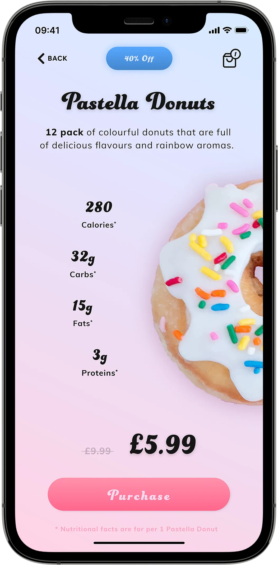
Day thirty-six's brief was to design a special offer for something, whether for an item promotion or a buy-one-get-one offer.
The idea was to design a discounted product screen for a dessert eCommerce app, blending bold imagery with a dynamic pastel colour palette.
The interface occupies a joyful aesthetic through its use of pastel gradient base colours and product imagery. The special offer tag and discounted price elements conveniently provide relevant offer content.
Day 038
Calendar
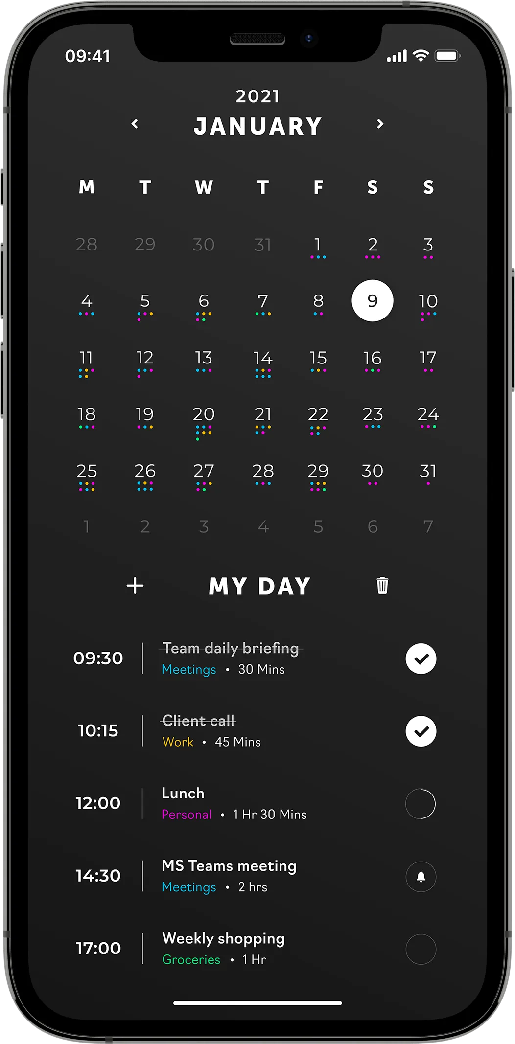
Day thirty-eight's brief was to design a calendar-focused element, whether for scheduling appointments or a reminder feature for email.
The idea was to design a task calendar app, blending an accented dark-mode colour palette with flat-styled elements.
The concern for design was devising a uniform layout for the to-do list feature. However, ample margining, a subtle dark gradient background, and vibrant content accents form a coherent experience.
Day 040
Recipe
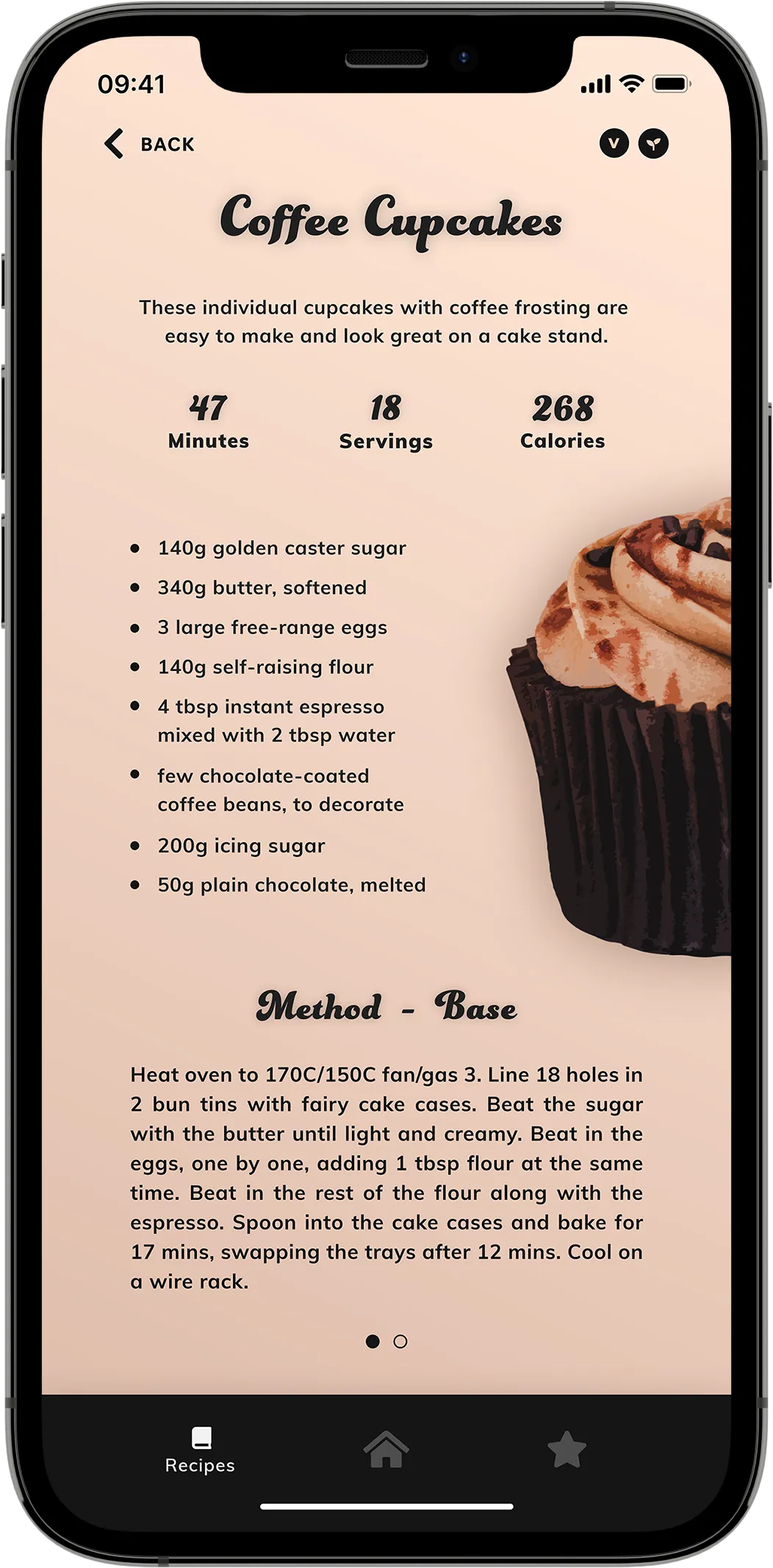
Day forty's brief was to design a recipe for an item of food, considering ingredients, instructions, nutritional content, and imagery.
The idea was to derive the layout from day thirty-six's brief to design a recipe screen for a baking app, utilising a parchment paper-inspired colour palette.
The image-revolved layout allows content to position itself accordingly, while the brown base colours conform the interface to tradition. Recipe methods are presented in stages depicted through swipe-navigable carousel elements.
Day 041
Workout Tracker
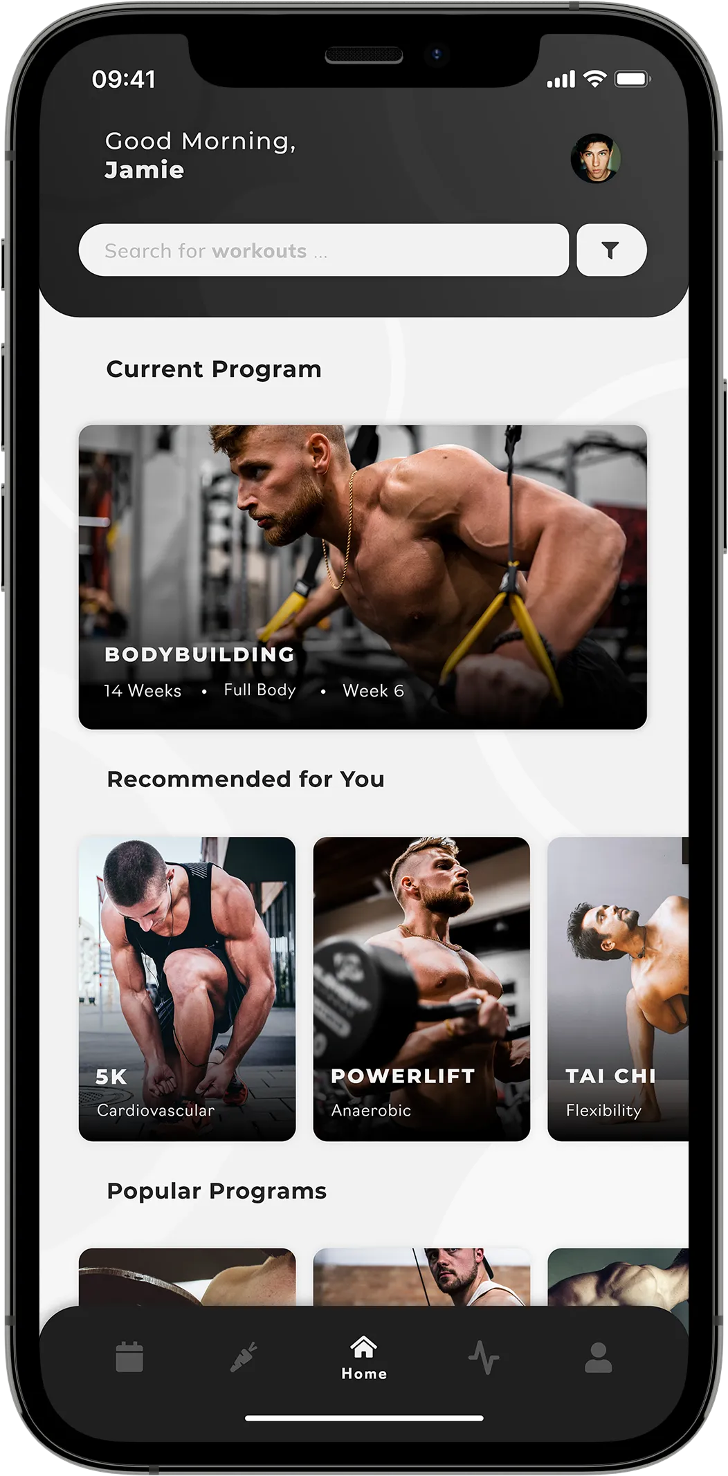
Day forty-one's brief was to design a workout routine tracker, whether for a personal workout or gym tracking equipment.
The idea was to design a fitness training companion app, utilising a card layout that featured tailored programs and activity-based tracking.
The card layout provides consistency throughout the design, while each workout program occupies identity through workout-related imagery. Ample activity-based tracking exists through related symbolism, data visualisations, and calendar elements.
Day 042
To-Do List
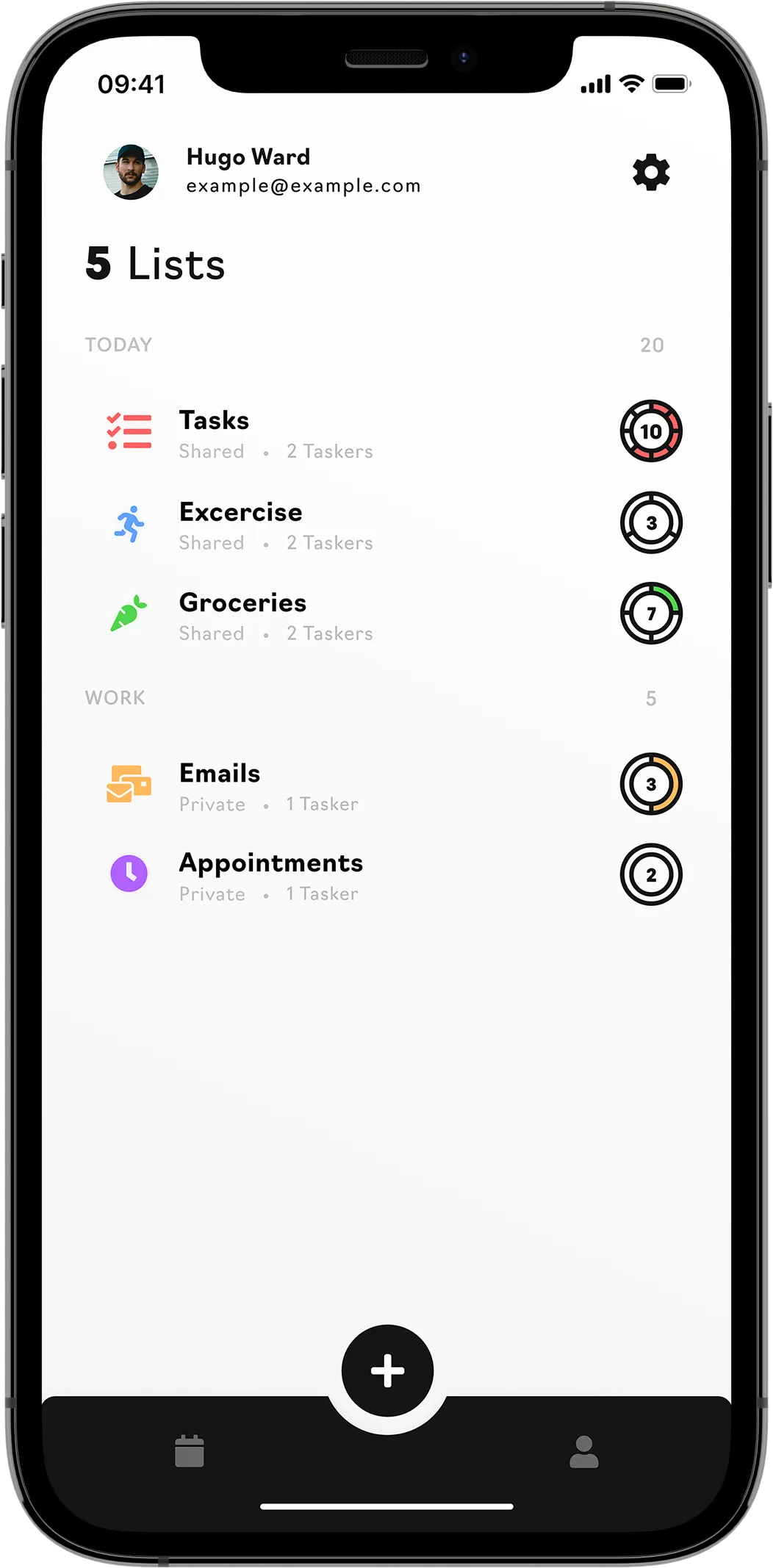
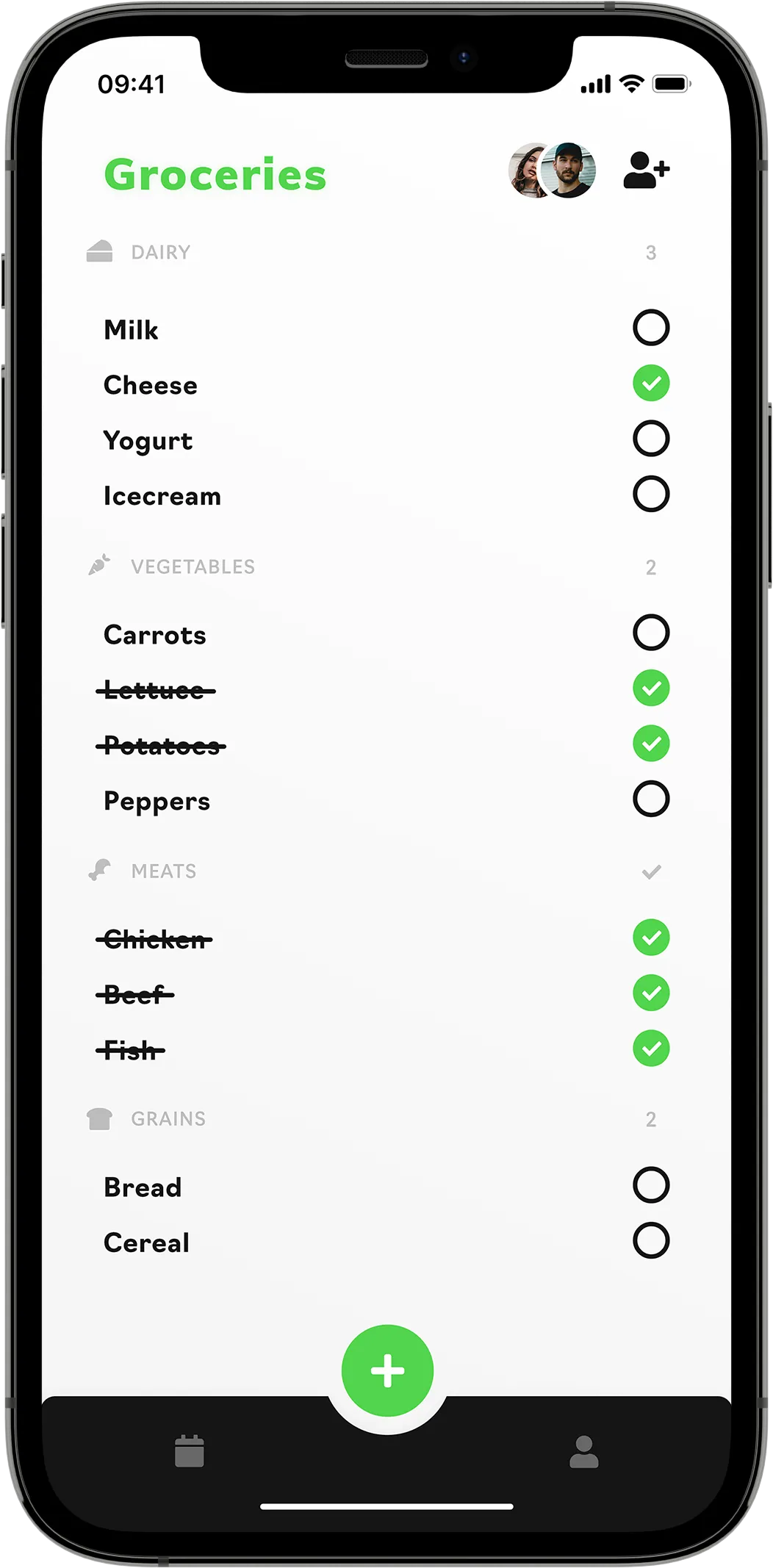
Day forty-two's brief was to design a to-do list for user-generated intentions, considering the purpose of functionally tracking these intentions.
The idea was to design a task manager app by combining successive categoric list navigation, suitable symbolism, and a dynamically accented colour palette.
The appropriate usage of negative space benefits simplicity within the interface. Categoric segment circles depicting completed sub-categories and nested number elements depicting the number of incomplete tasks provide immediate insight.
Day 043
Food/Drink Menu
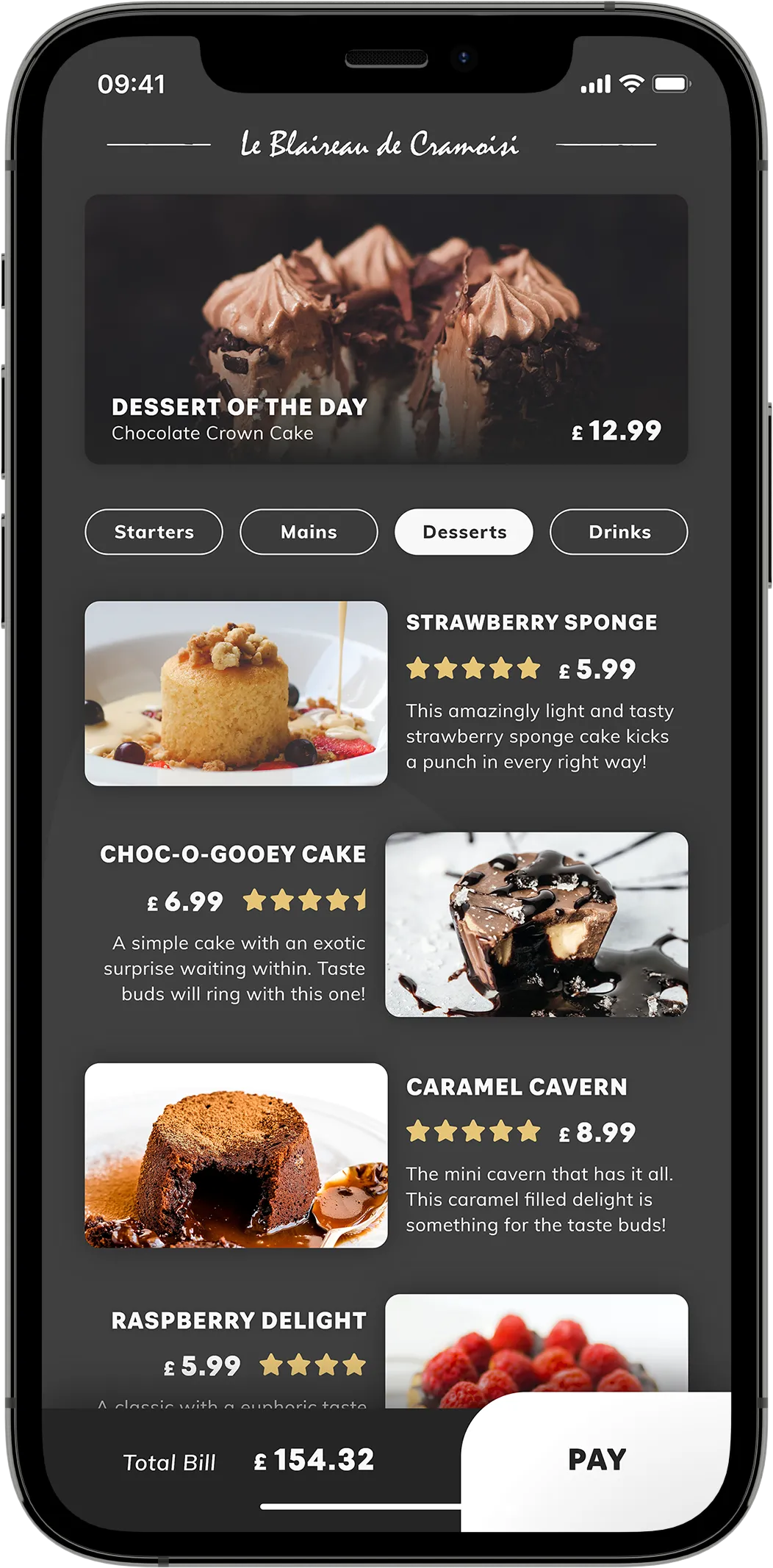
Day forty-three's brief was to design a food and drink menu, considering product context, pricing, nutritional content, and imagery.
The idea was to design a fine-dining restaurant companion app, utilising segmented tag navigation and a sophisticated colour palette.
The contrasted monochrome base colours provide an accessible experience, while the product imagery promotes dishes accordingly. The global tag navigation eases interaction alongside the unique checked layout that naturally sections each dish.
Day 050
Job Listing
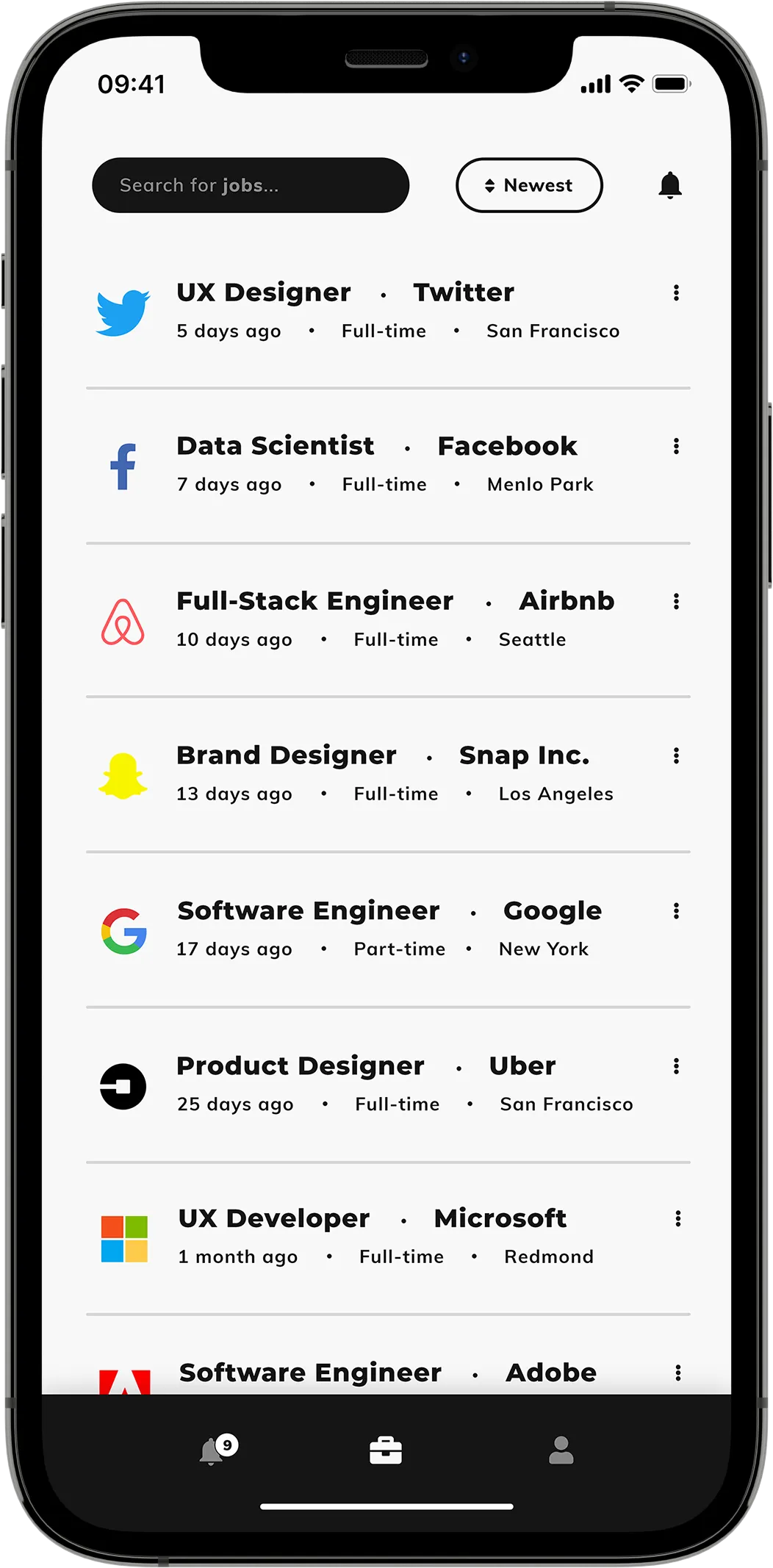
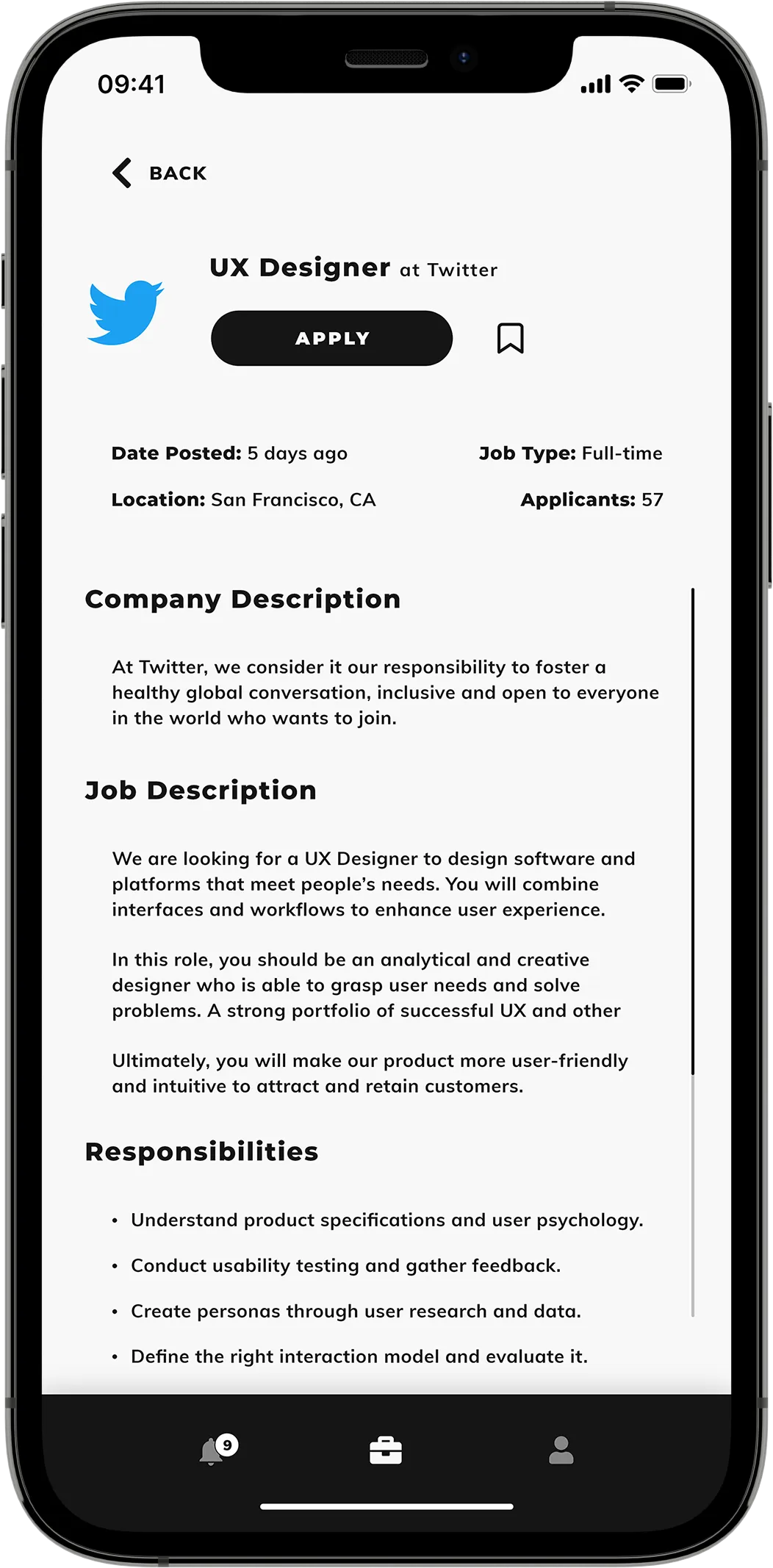
Day fifty's brief was to design a job listing, considering position context, title, employer, location, date, type, responsibilities, skills, and salary.
The idea was to utilise structured information architecture to design a minimalistic job board that featured search and sorting functionality for a job listing platform app.
The vibrancy of employer branding complements the global monotone base colours, furthering the interface's minimalist-inspired style. Variable font-weight usage throughout promotes coordination and creates an intuitive experience.
Day 052
Logo Design

Day fifty-two's brief was to design a logo, considering its usage capacity, animation potential, branding, and size.
The idea was to design a logo for my guild's Discord server, Nocturnis, where most members play at night.
The logo suits the guild's meaning, with the wolf head symbolising the night and the secluded letter "N" reflecting the guild's name. Other guild admins were thrilled with the design, and it has been our logo ever since.
Day 061
Redeem Coupon
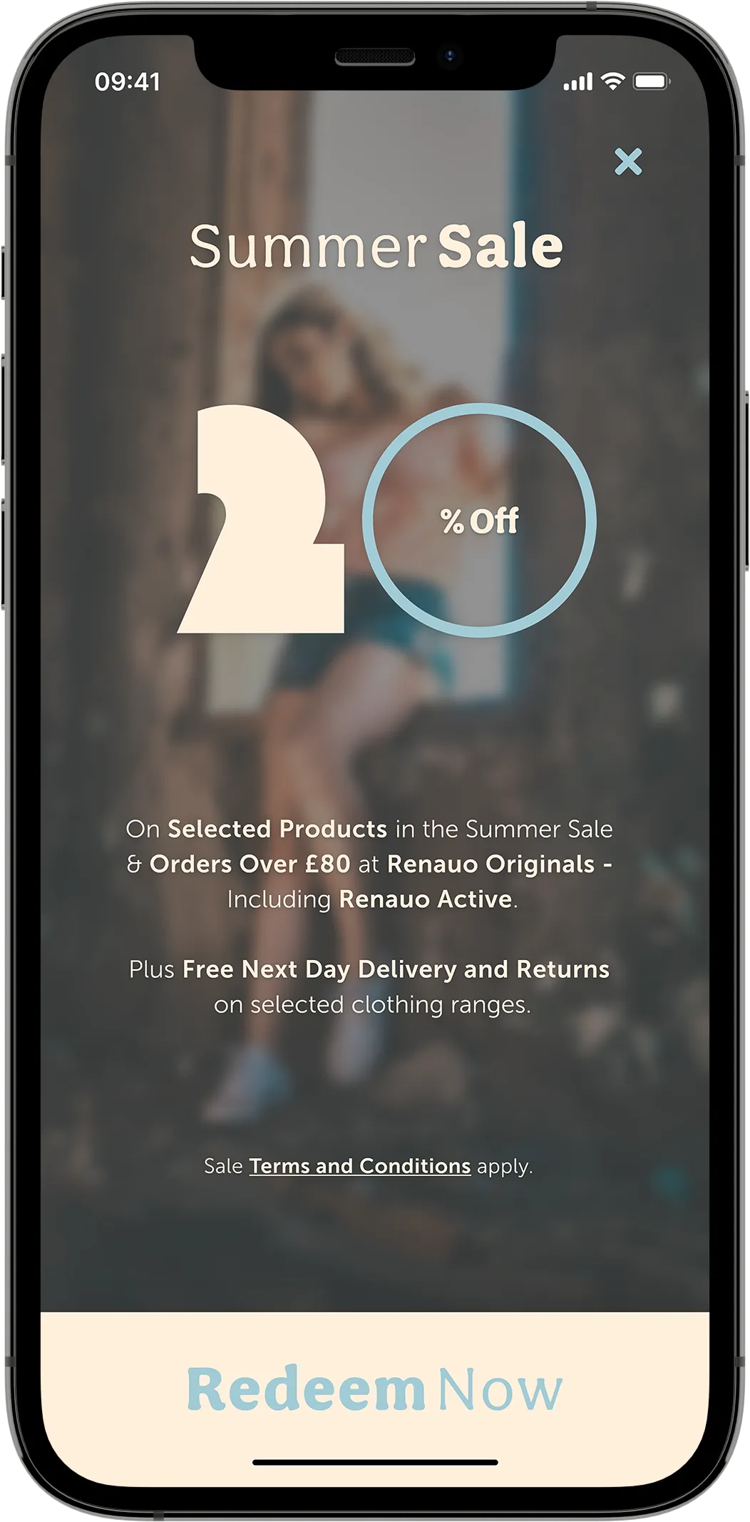
Day sixty-one's brief was to design a coupon-focused element for redeeming, considering the discount percentage, subtotal, and total.
The idea was to design a private sale screen for an apparel eCommerce app, utilising a combination of trendy typography and a summer-inspired colour palette.
The blend of unique typography above blurred summer-inspired imagery sets the stage for the sale content elements. The bold use of fonts draws attention, while the "redeem now" CTA provides pleasant interaction.
Day 062
Workout of the Day
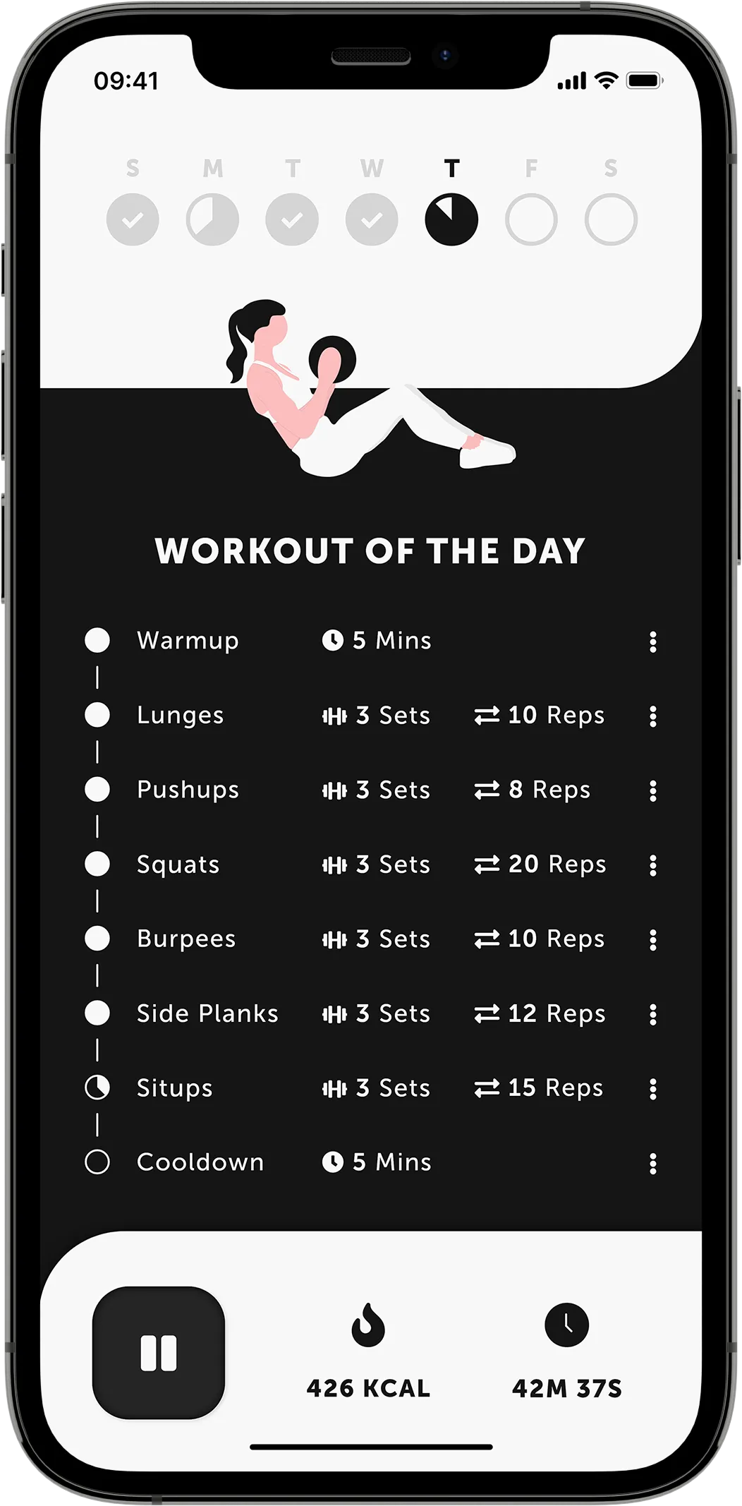
Day sixty-two's brief was to design a workout of the day focused feature, considering the workout context, sets, and reps.
The idea was to design a daily fitness workout app, incorporating dynamic exercise illustrations and a monotone colour palette.
The contrasting monotone base colours separate the interface's three main sections, giving room to form a list of exercises. Symbolism enhances context throughout, while a usable pause button allows for extended breaks if required.
Day 064
Select User Type
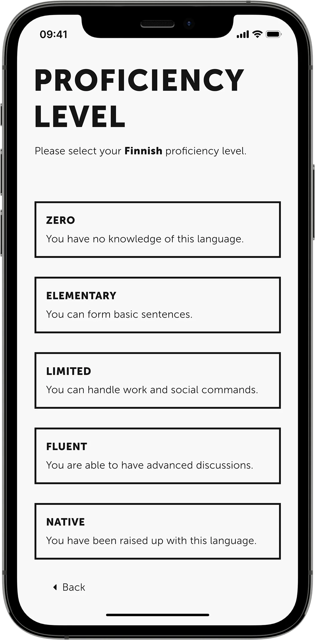
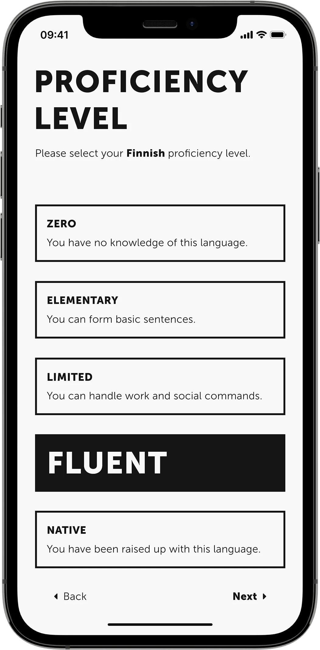
Day sixty-four's brief was to design a select user type feature, whether for an app's sign-up experience or a game's class system.
The idea was to design a proficiency selection screen for a language learning app, utilising a striking yet simple style.
The interface occupies a brutalist aesthetic by deploying bold outlines and typography. The structure of proficiency card content assists with user self-assessment, while an inverted appearance depicts the selection state.
Day 066
Statistics
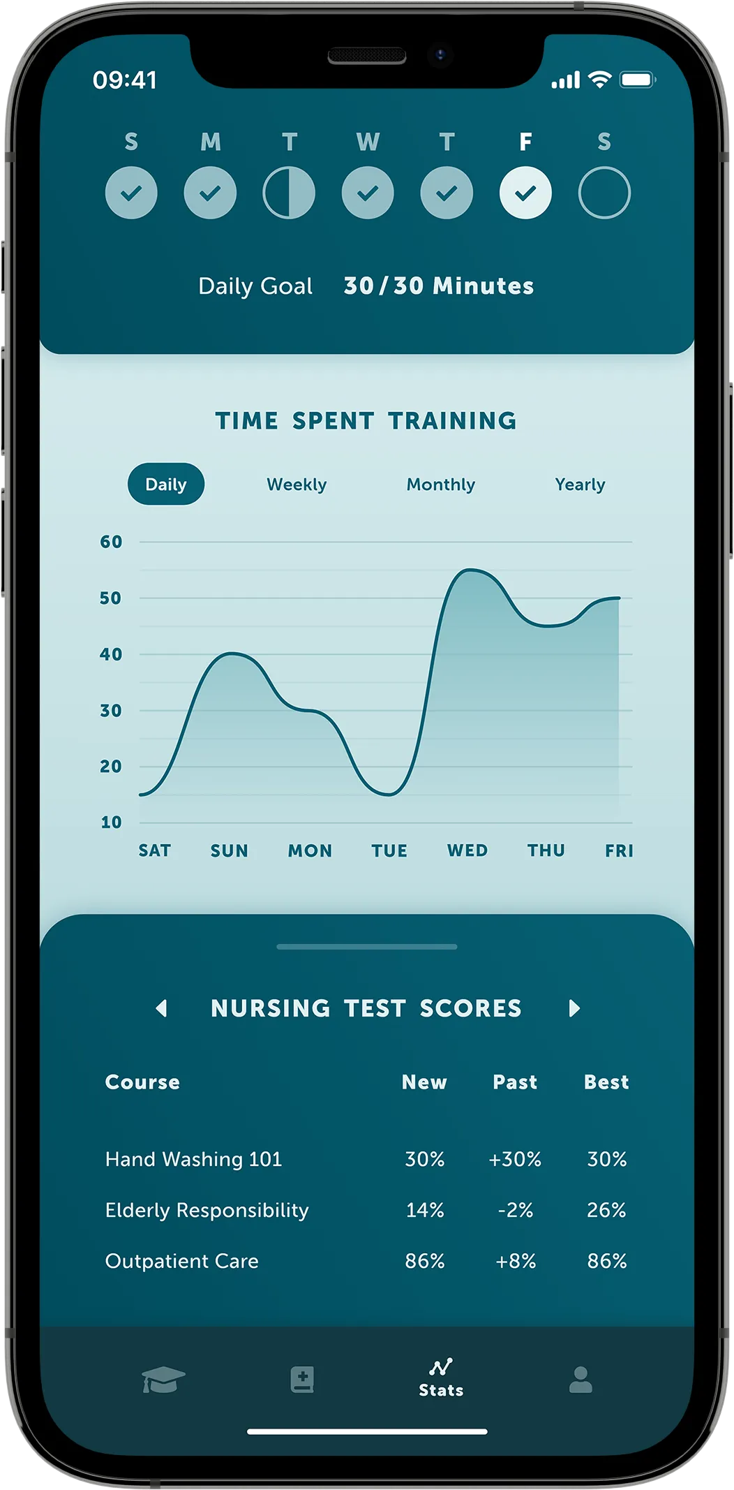
Day sixty-six's brief was to design a statistics-focused interface for any intended purpose, considering statistical context and relevant data sets.
The idea was to design a training statistics screen for a medical training app, utilising clear data visualisations and a turquoise colour palette.
Duration-based data is presented through intelligible curve graph visualisations, while practical course score data nests neatly below. The differentially toned base colours divide data sets, creating an accessible experience.
Goddard
Project Goddard was a UX/UI project targeted at the Finance sector for my Honours year at Abertay University. I have since continued the project's development beyond its scholarly roots by forming a business start-up.