Goddard
has been an Ongoing project since Sept. 2021
using Adobe Ai, Adobe Ps, Asana, Draw.IO, Figma, Trello and Validate
Overview
Project Goddard was a UX/UI project targeted at the Finance sector for my Honours year at Abertay University. "Goddard" is a fictional project name.
The project and its dissertation paper aimed to discover an accessible approach to delivering financial concepts and terminology.
Through user and market research, wireframing, prototyping, user testing, and iteration, Goddard became my most challenging project to date. As a result, I have greatly expanded my knowledge and skills in user research and UX/UI design.
External sentiment matched mine regarding beliefs that Goddard holds great potential to help users. So, I have decided to continue the project's development beyond its scholarly roots by forming a business start-up.
This discovery summarises Project Goddard at a high level.
The Problem
Studies have shown a correlation between the possession of good financial knowledge and sound decision-making. However, most people of all ages lack this basis of knowledge to make such decisions.
Several factors onset a lack of one's financial responsibility. These include:
-
poorly recalling prior knowledge in the long term;
-
too much confidence in one's own rationale;
-
and an unfit course of professional advice.
Furthermore, mental health is a fierce factor, where one's habits often boost weak decision-making with finance.
The Solution
Financial Education


Goddard was devised as a companion mobile app to solve the lack of sound footing in finance.
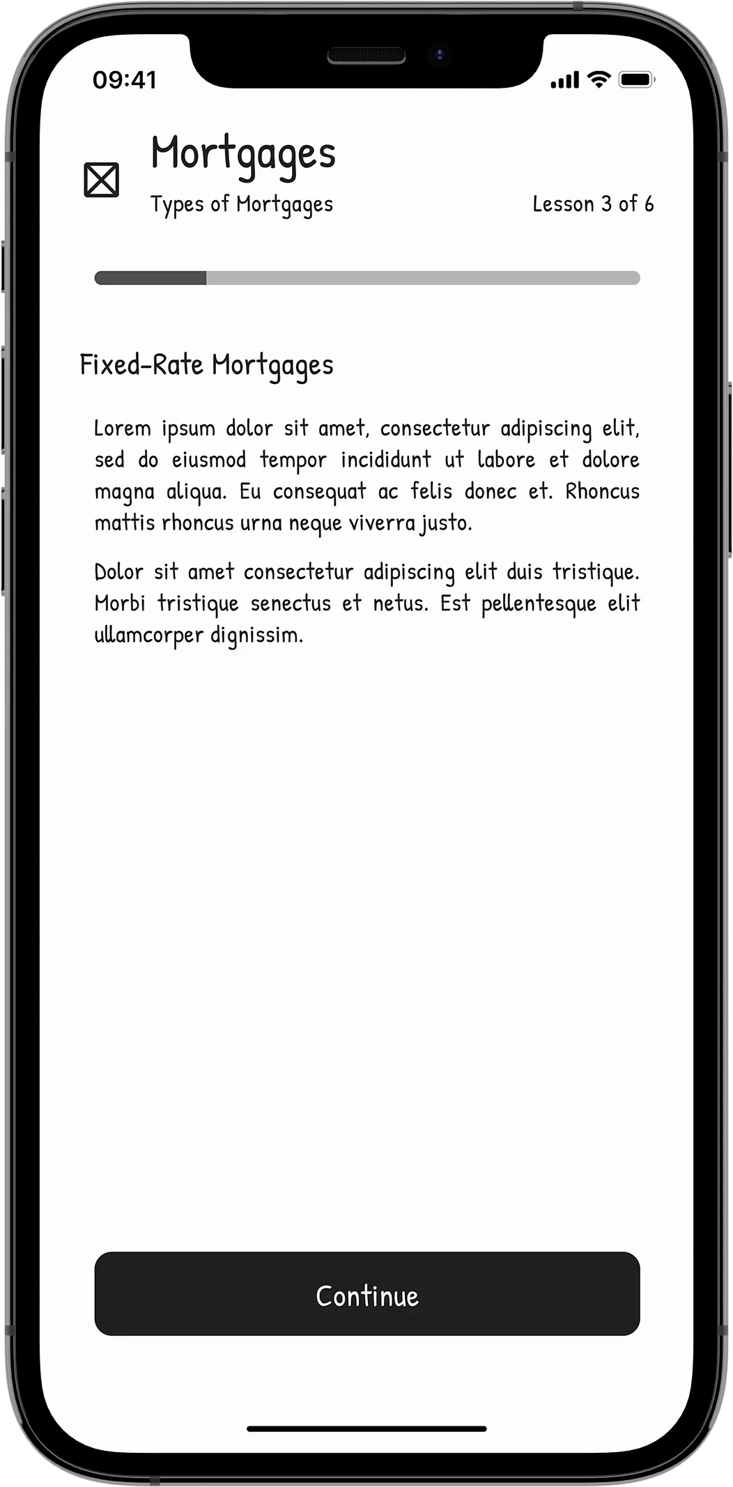
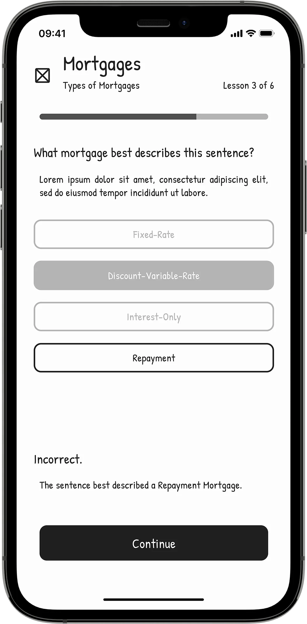
The app helps one to learn and retain relevant subject matter through practical knowledge offered in a friendly format.
Gamification features throughout the app encourage one to review and grow their knowledge base and improve their recall.
Meets Financial Insights


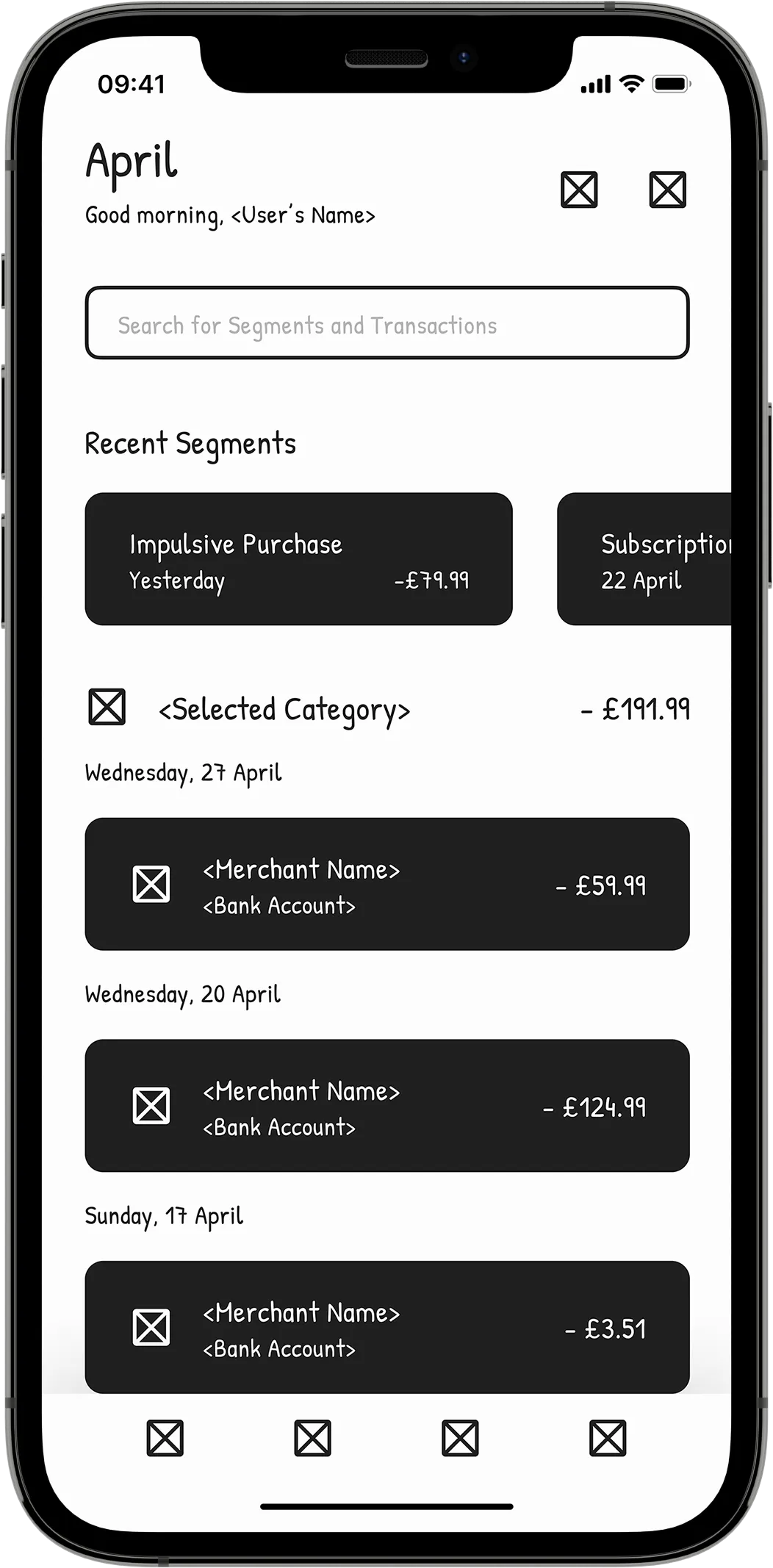
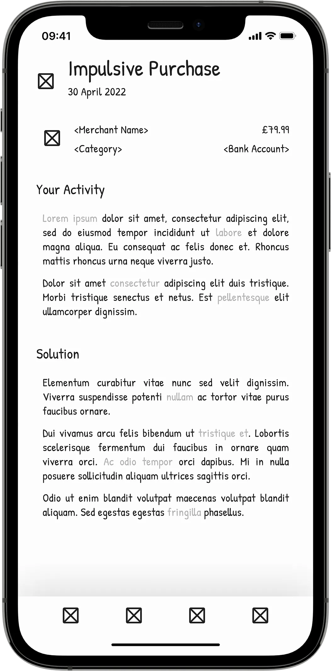
The app allows one to examine and build upon their finances. It helps them initiate action to improve their responsibility by supplying AI-based insights.
Passive insights encourage one to act on their unhealthy trends to foster healthier habits. At the same time, active insights allow one to pursue a budgeting plan that works for them.
Design Process
Research and Ideation
I commenced the project by discovering the problem to solve through design. Once I defined the problem space, I organised my solution and formed its target audience.
Afterwards, I analysed my solution's competitors to gain inspiration, seeing what they solved for their audience and what could be improved.
Based on my research, I ideated and broke down Goddard into individual "aspects". Aspects would involve screens that made up the solution application. I broke these down further into "required" and "optional" aspects to define the project's scope.
Wireframing and Prototyping
Once I achieved my research, I wireframed several variants for each required aspect in Figma. Halfway through this process, I created a short wire flow to test basic interactions.
I then built the app's higher fidelity "transitional" prototype in Figma, which I would later use in real-world testing. This prototype was based on the latest variants for each aspect. It included advanced interactions for transitions and unique features.
As this was an Honours project, I deemed I would only design optional aspects if I had time remaining in my semester. These acted as stretch goals.
Testing and Iterating
Later in the project, the transitional prototype was exposed to a closed, remote round of user testing. This testing would inform a final prototype for marking and initial production.
I prepared for this testing group by writing a script that would help run each test smoothly and keep the round consistent in nature.
Ten users that fulfilled the app's target audience criteria were asked to perform several tasks at a pace that suited them. I gathered insights from their usage and direct verbal feedback as they performed their tasks.
As each test ended, I collated the stream of data in a large, organised document. Once the round of testing was achieved, I analysed this document, crossmatching data sets to see what was liked and what aspects needed crucial iteration.
Developing and Venturing
Goddard was only supposed to exist in prototype form for an academic submission. However, since I have decided to continue the project's journey as a start-up, I am now at the stage where I need to develop the application through code for mobile.
I am exploring languages, frameworks and databases to form an efficient and reliable solution stack. Developing the app is a learning endeavour in and of itself, contributing to my growth and skillset.
Furthermore, I am pursuing business practices with support from Abertay's Bell Street Ventures. I am forming a strategic model for Project Goddard so that it has a steady course to begin from and follow in the long term. In addition, I am exploring means of financial support to kickstart Goddard and aid in its longevity.
I will update this portfolio section in due course (last updated on 10/04/2023).
Challenges and Lessons
Project Goddard has been a journey in learning a new tool, Figma, and designing a product to genuinely help and place people on a better financial path forward. It was — and still is — a joyous journey, with many exciting discoveries at each stage.
Having used Figma over the lifetime of the project, I have come to appreciate its value as a purpose-built tool. Learning of it firsthand through trial and error led to some surprising findings. Most notably, Figma's browser memory limit warnings will prompt me to split up future projects into separate, more efficient files.
The way of learning unaided has procured the majority of my knowledge of Figma to date. However, that is not to say I didn't search its forums in times of need. In doing so, I learnt how to create time-saving interactive components and find answers to problems that arose, which opened my eyes to a wonderful community of designers.
While I have become adept at Figma and have designed the product I envisioned, which has earned public approval, its journey continues with its production. Goddard has an ambitious road ahead, but one that will yield new wisdom in programming and entrepreneurship.
NUΛNO
NUΛNO was an end-credits scene concept for a fictional sci-fi-inspired cross-platform game. Created entirely within Adobe After Effects, I intended to learn more about the software's JavaScript expressions.